


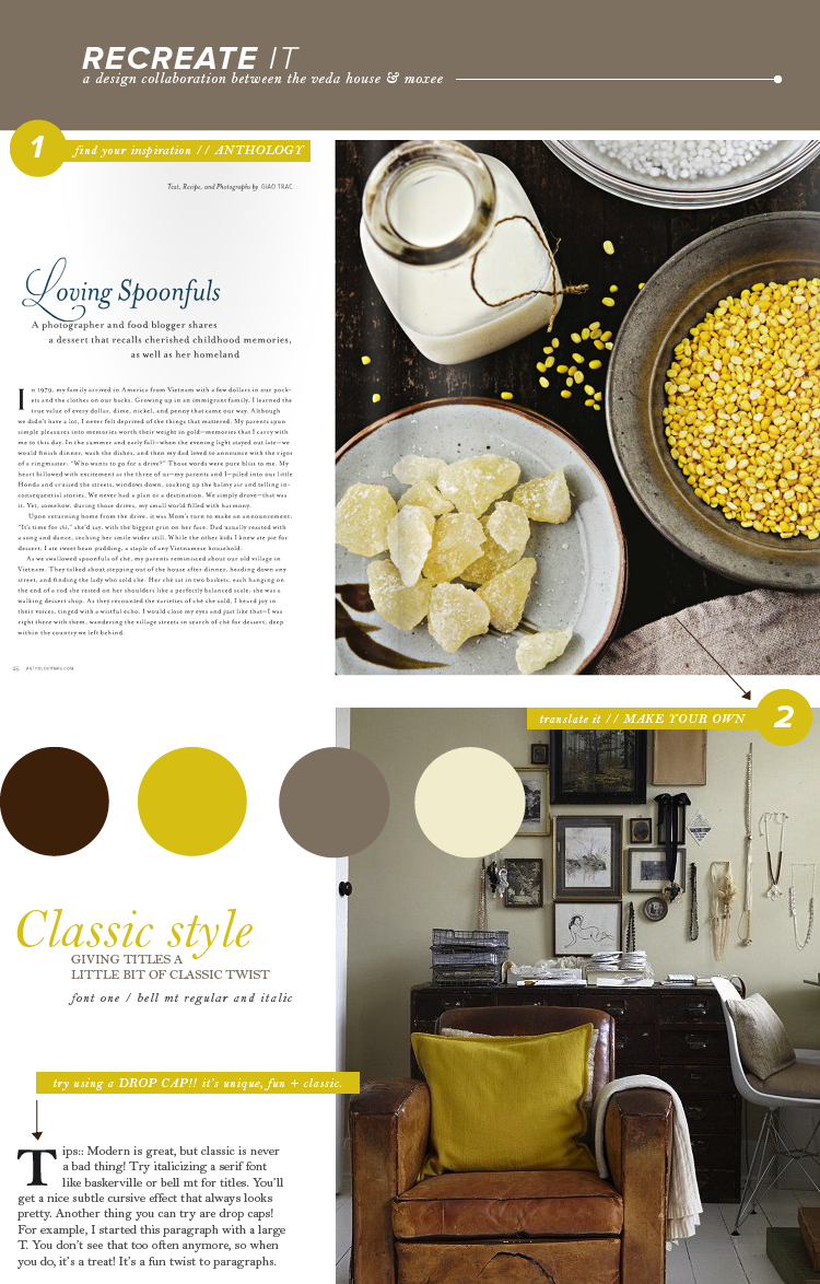
Whoa. It’s been two whole months working with the lovely cassie already, bring you all recreate it posts week after week!! So this time I’m keeping things classy. I pulled a spread from Anthology, which has an overall traditional feel to it. By using a combination of serif fonts, classic paragraph spreads, and drop caps, you’ve got yourself a pretty classy looking spread. If you tend to stick more towards modern design, why don’t you give this a try sometime? Classic traditions are never a bad thing, they’re actually refreshing nowadays.
In contrast, Cassie picked out a fun loving & feminine spread for her piece over on moxee. Check it out!!
Anthology / photo / bell mt / breanna rose
