Brand Design Photography & Styling Clarity Consulting

recreate it / 10

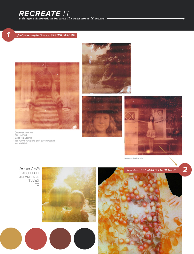
Papier Mache is the sweetest little magazine one could follow! Filled to the brim with cute kids, you know it’s a winner. When I stumbled across this spread, I instantly knew I had to write about it. The way the photos are laid out with white space surrounding kinda sorta reminds me of a wall, and how some may choose to hang frames. It’s neat how a magazine can remind you of that stuff, right??

When working with photos, don’t forget to mix things up from time to time! I definitely forget this myself, all too often. It’s so easy to get in the habit of lining things up nice and tidy, but look at how cool it can be when you DON’T do that!? Now, go have some fun. Whether it be online or some frames on a wall, be different.

Now, do head on over to moxee to see what Cassie is up to. Fun fonts alert!!

papier mache / tuffy (free!) / photographs / breanna rose


recreate it / 09

I found the photography in this spread from we like we love to be very stunning. The imagery has this almost rainbow like texture on top of it, which gives off all sorts of nostalgia. If you own an old polaroid camera or know someone who does, you should definitely head outside and see what kind of light leeks you can get into your photographs. It’s the imperfections that are beautiful!

Another aspect that I fell in love with was the type setting. They definitely had some fun with this spread! Have you ever tried cutting out parts of letters? It makes for some interesting shapes, that’s for sure. You can keep it as simple or intricate as you’d like … you be the judge.

Guess what?? Cassie has some downloadable brushes lined up for you all over on her recreate it post for moxee this week. Check it out!!

we like we love / photograph / univers / breanna rose


recreate it / 08

Whoa. It’s been two whole months working with the lovely cassie already, bring you all recreate it posts week after week!! So this time I’m keeping things classy. I pulled a spread from Anthology, which has an overall traditional feel to it. By using a combination of serif fonts, classic paragraph spreads, and drop caps, you’ve got yourself a pretty classy looking spread. If you tend to stick more towards modern design, why don’t you give this a try sometime? Classic traditions are never a bad thing, they’re actually refreshing nowadays.

In contrast, Cassie picked out a fun loving & feminine spread for her piece over on moxee. Check it out!!

Anthology / photo / bell mt / breanna rose


recreate it / 07

This week’s recreate it is probably my favorite color palette thus far! And I’ll be honest, I don’t explore the world of purple quite often – but it’s growing on me more and more. What got me about this spread from Sweet Paul Magazine was the simplicity of it all. Not only that, but the designers translated the photograph’s feel to their typography as well. I mean, check out where they wrote “finger food.” They actually ADDED space (kerning) between the letters to compliment the photo. Well done!

As usual, Cassie has a beautiful color palette picked out herself over on moxee … check it out!!

sweet paul / photo / helvetica neue / breanna rose


recreate it / 06

Hey there! For this week’s recreate it, I challenge you guys to get all organized on me, okay?! I always love seeing random items and objects neatly laid out nicely and photographed. There are so many different outcomes that can happen that it’s almost like an art in itself! So when I saw this spread in NEET magazine, of course I fell in love.

So what do you say? Find some cool objects in your place and arrange them how you’d like! In this spread, they used all sorts of colors, but you can also limit yourself to one or two colors to make things even more neat and tidy. Honestly, showing little collections of things you own could make for a pretty cool blog series if you want to give it a try! I’d love to see them, that’s for sure!

Don’t forget to check out Cassie’s post over on my blog, moxee.

neet magazine / photograph / nevis / neutraface / breanna rose


recreate it / 05

I can’t believe we’re already into the FIFTH week of recreate it posts! Time is certainly flying. If you’re new and wanna check out the past month, here are the links: 1, 2, 3, 4.

Now, this week’s post is certainly bright, but that’s the point! Because it’s currently fall and winter is upon us, people sometimes forget about those bright summery colors. I’m not saying you should fill your space with them – but definitely don’t leave them in the dust, that’s for sure! Pops of color, like these, are often EYE catching and will grab a viewer’s attention straight away. So why not give them that POP? Try it out and make sure you check out Cassie’s feature this week over on moxee.

we like we love / graphique pro / photos / breanna rose


recreate it / 04

You know what? There’s absolutely nothing wrong with simplicity. In fact, I’m quite the fan when it comes to minimal design! Let’s take this spread in one magazine, for example. A single photograph covers the entire page, while a thin font displays one word: mirage. Don’t be afraid of simplicity, it’s quite beautiful when done right.

I know Cassie has a GREAT recreate it post going on over at moxee this week, so make sure you check it out!

one magazine / photograph / mensch / breanna rose


recreate it / 03

This week’s recreate it takes us to RUE for inspiration. This particular spread from the magazine hits home for me, literally. The images on the left are taken from my favorite thrift store here in the Minneapolis area called Hunt & Gather. But beyond that, this spread gives a great insight into layering and making things funky. After all, Bri Emery – the head designer for RUE is famous for that. Give layering a chance, folks. You can come up with some pretty fun pieces!!

As usual, don’t forget to check out Cassie’s recreate it piece this week on moxee!

rue / photo one / photo two / droid serif / proxima nova / breanna rose


recreate it / 02

Hey everyone, Bre here! First of all – thank you so much for all of the great feedback Cassie and I both received last week for our initial “recreate it” post. It was great to hear our collaboration was interesting and useful. Let’s just say, it’s here to stay!

I chose a spread from Collected Mag this week, which always uses such simple and gorgeous layouts. The reason I chose it was because they took some fun risks! Layering text on top of your photography is always a challenge – especially when you’re trying to make sure something is legible. I chose to use a transparent block of color (brown) to help make sure everything was easy to read. Now it’s your turn to try. Plus, both of the fonts I picked out are FREE, so make sure to go get em’!

Don’t forget to head on over to moxee for Cassie’s recreate it post!

photo / st marie / gentium basic / collected mag / breanna rose


recreate it / 01

Hi guys! I’m excited to announce a new design collaboration happening here every Wednesday with Bre of MOXEE. The two of us have really “hit it off” in the terms of designer-to-designer relationships, and we felt like it would be fun to share some design insights with you. We could go on and on about what typefaces we drool over or what design websites keep us glued for hours, but that would only bore you over time. Instead, every Wednesday we are going to share 2 Recreate It posts (one here on my blog and one over on her blog) that will hopefully help you translate those pretty magazines spreads you see into something more tangible. Hey! You may even get some new blog post layout ideas from it. Hope you enjoy this new feature as much as the both of us. Cheers!

kinfolk / photo / grotesque mt / linux libertine / aw conqueror / breanna rose


Loading...