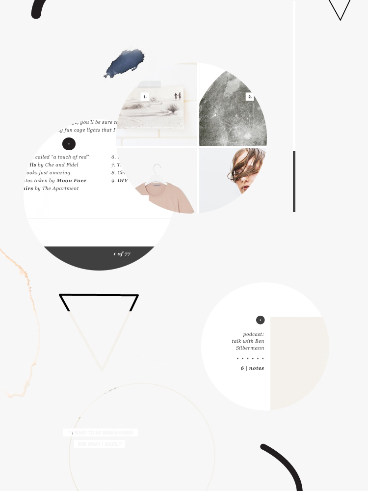
Today I’m sharing a little sneak peek of the new Veda House rebranding. It’s taken me quite a while to develop a look I was really happy with. I wanted an overall look and feel that was a contrast of light and dark, a contrast of thick and thin, contrast of subtle and bold.
I’ve discovered through this whole process that my personality and what I’m drawn to seems to be on either end of the scale. Its either really graphic and minimalistic…or its natural and moody. I needed a way to visually show the contrast.
A full blog launch will be happening in the coming weeks (as soon as I finish the new Veda House logo) as well a fun new project I’m calling “Studio Hours”.
Stay tuned. I’m pretty excited over here 😉


