Brand Design Photography & Styling Clarity Consulting

A little redesign

So I’ve been jumping from design to design over the past month searching for something that represents by design style as a designer as well as how I want my blog content displayed. I feel like I’m finally heading into the right direction and would love to hear your thoughts.

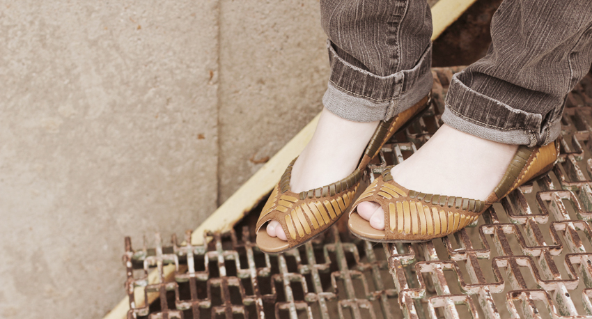
This new design pluses up the content area with a major focus on photography. I feel the images can speak for themselves, so I’m trying to get rid of the extra fluff.

I’m in the process of converting some of my old posts to the new image format, but it will take some time for everything to look consistent. Please hang in there and let me know if something isn’t working.

6 comments on “A little redesign

  1. Hi!

    I like the huge images, although my screen computer is too small to view all your blog at the same time, but I guess the general screen size is bigger:p
    Hope you’re having a lovely day!

    Carmila Ponycat

  2. love it love it love it. Yours is a blog that works perfectly when you get rid of the extra junk everywhere. not that it was junk before, but i think you know what i mean…

  3. I definitely approve. I like it a lot. Not that I didn’t like it before…but this definitely is more clean, crisp, concise. And, it definitely does showcase your photography.

    Lovely.

Leave a Comment

Loading...