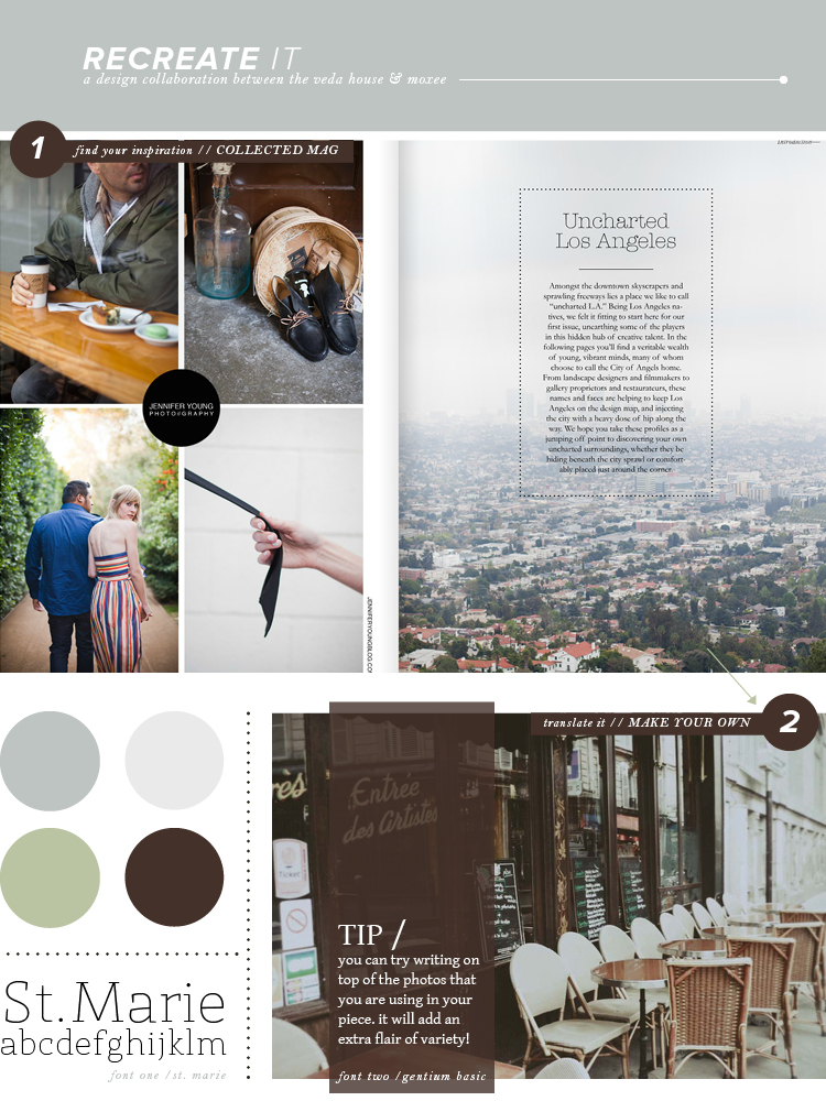
Hey everyone, Bre here! First of all – thank you so much for all of the great feedback Cassie and I both received last week for our initial “recreate it” post. It was great to hear our collaboration was interesting and useful. Let’s just say, it’s here to stay!
I chose a spread from Collected Mag this week, which always uses such simple and gorgeous layouts. The reason I chose it was because they took some fun risks! Layering text on top of your photography is always a challenge – especially when you’re trying to make sure something is legible. I chose to use a transparent block of color (brown) to help make sure everything was easy to read. Now it’s your turn to try. Plus, both of the fonts I picked out are FREE, so make sure to go get em’!
Don’t forget to head on over to moxee for Cassie’s recreate it post!
photo / st marie / gentium basic / collected mag / breanna rose


