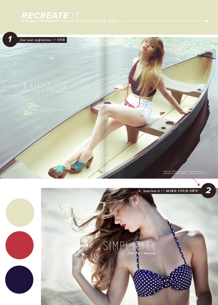
You know what? There’s absolutely nothing wrong with simplicity. In fact, I’m quite the fan when it comes to minimal design! Let’s take this spread in one magazine, for example. A single photograph covers the entire page, while a thin font displays one word: mirage. Don’t be afraid of simplicity, it’s quite beautiful when done right.
I know Cassie has a GREAT recreate it post going on over at moxee this week, so make sure you check it out!
one magazine / photograph / mensch / breanna rose


