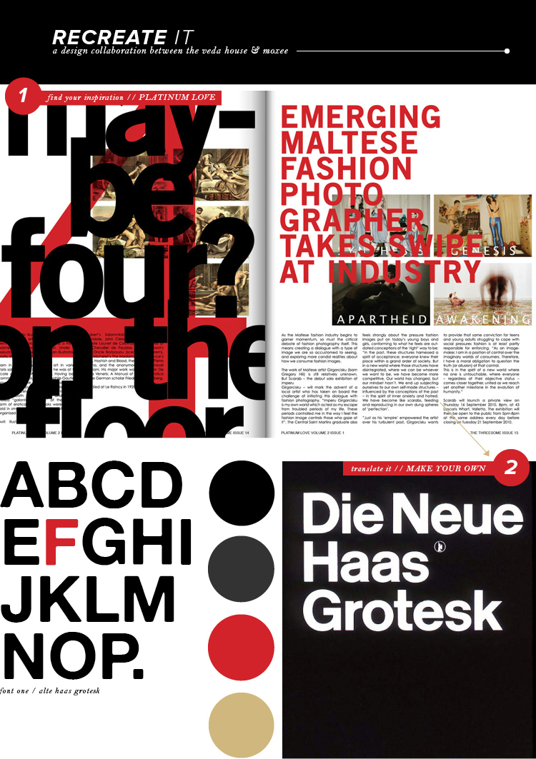
Okay, I know this is the most intense recreate it post to date, since there’s a whole bunch of black + red typography going on, but I couldn’t help it. I came across this amazingly awesome swiss inspired spread in Platinum Love Magazine and instantly new I had to write about it.
Back when I was in design school, one of my favorite things to learn about was the history of SWISS design. I remember staring at all the bold work and falling in love each and every time … my true love lies within typography forever and always.
So, despite the images above being intense, look at how well the type is laid out, layered just so and true to Swiss form. By using clean and modern san serif fonts, paired with bold colors ( usually white, black, and red ), you too can come up with your own little swiss inspired design! Have at it.
platinum love magazine / alte haas grotesk (free!) / poster / breanna rose


