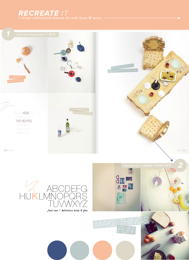
One thing that I truly admire about RUE is just how bright + fun it always is. You just know that with Bri Emery behind the scenes, you’re going to get some fun spreads and color. This miniature house shoot was by far my favorite part of their January issue, that I instantly knew I needed to share it. But what really made me extra excited about this spread were the quirky parts. The text is slanted, opaque, and titled just so. Then, there’s the tiny scribble to the left, just cause … it all works!
I know I forget this all the time – but it’s okay to go outside of the box. Often we get stuck in ruts and become repetitive. This just shows you that fun looks good. So why not give it a try, huh!?
And of course, don’t forget to check out Cassie’s post over on moxee!! She’s mixing things up this week.
rue / photos / helvetica neue lt pro / breanna rose


