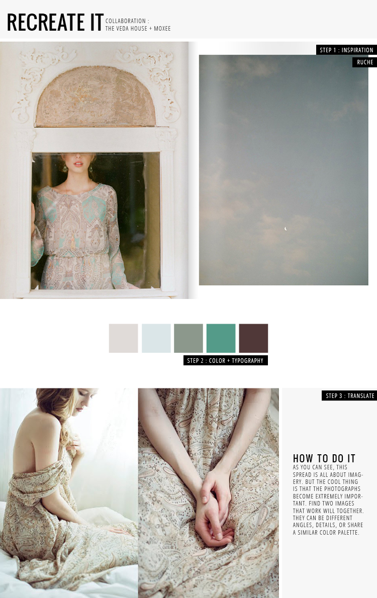
I wanted to take a look at the latest lookbook for Ruche, which is absolutely gorgeous. There is no text in this book, so photography is key for communication in this case … but guess what? They handled it so well. One of the most interesting parts I found was the placement of imagery. In most cases, they would have a zoomed out view of an outfit on one side, with a matching photograph on the other. Now, this matching photograph could either be a detailed shot or an image that’s completely different, but share similar colors. Try it out sometime! Mixing and matching can be completely refreshing + fun to do.
ruche lookbook / anette schive / breanna rose


