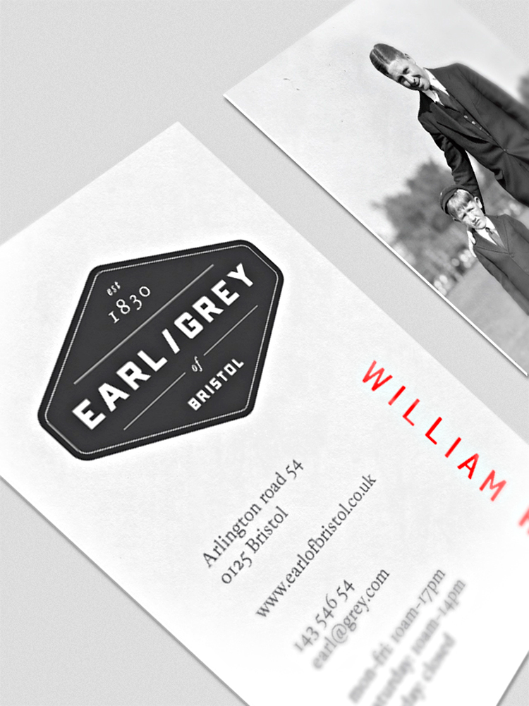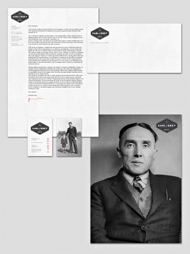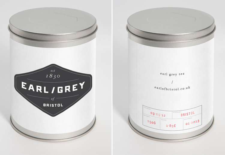

 I absolutely love the identity work Jonathan did for the fictive company called “Earl/Grey”. This project aspired to bring popularity back to a once favorite tea flavor. The typography is well though out, the packaging is based around simplicity and all the little details bring his story to live.
Stop by Jonathan’s portfolio to see more great graphic design work!


