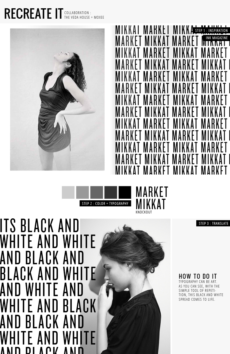
I thought this spread from Ink Magazine was intensely cool. Focusing on shaking things up with repetition + typography, aren’t we!? Sure, the designer could have simply had “Mikkat Market” centered on the right side with plenty of white space. But you know what? They didn’t! A little fun was thrown in … I mean, how often do you see a full page of repeated text like this?
I had a blast with my example of typography repetition on the bottom and decided to take it a step further by overlapping my text on top of the image. It added a little extra dimension for kicks. Go have fun and repeat things like crazy, folks!
Ink Magazine / photograph / knockout / blogged by breanna rose


