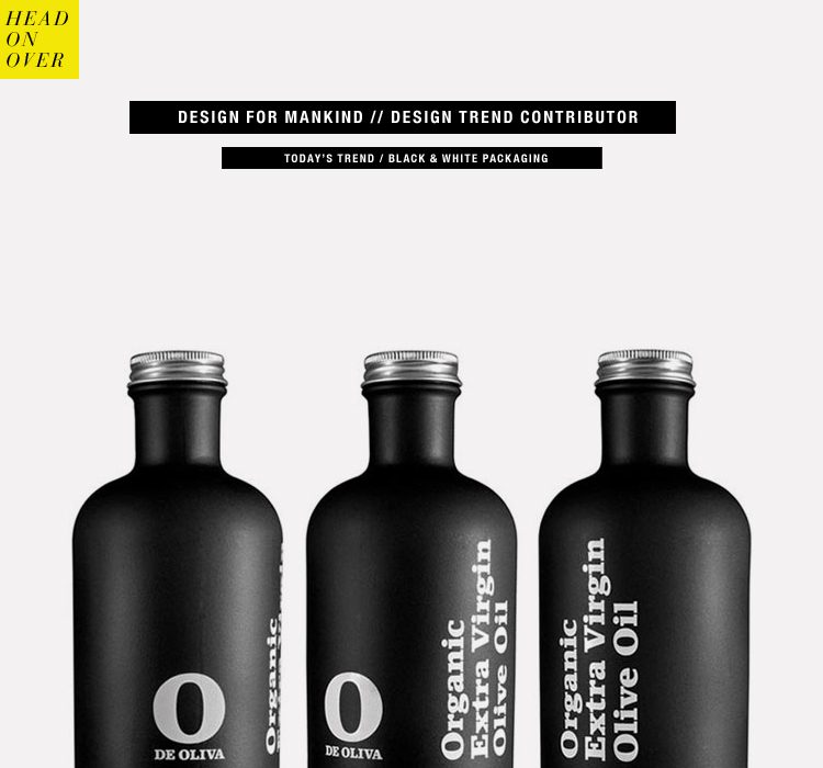
We’re finally back at it with another “Trending Graphics”over at Design For Mankind. Things have hit a little crazy patch over here. Last Friday I was sharing a new graphic trend that was all about black and white packaging. One of my biggest pet peeves about the packaging industry is that most packages are cluttered with unnecessary “stuff”. I loved how the simplicity of black and white was paired with the simplicity of design elements. Hop on over to see some examples!
Previous Trends:
Week 1 // Geometric Assembly
Week 2 // Typographic Packaging
Week 3 // Double Exposure
Week 4 // Vintage Inspired Graphics
Week 5 // Ampersand Love
Week 6 // Iconography
Week 7 // Handwritten
Week 8 // Bold Brush Strokes
* The above image is from All Things Stylish on Tumblr


