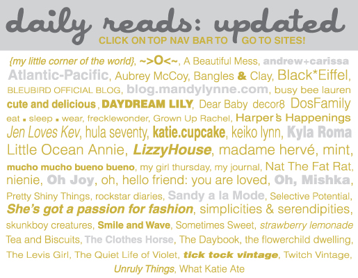
Summary of my weekend: HTML hell! I’ve been trying to update some really simple things on my blog this weekend and I’ve realized that WordPress is probably not the best platform for blogging. Yes you can customize the hell out of it if you are an HTMl wizard, but if you are not…then get ready for some painful days trying to code simple elements. Anywho…I’ve updated my daily reads section of the blog. I used to have my daily reads in my sidebar, but I thought they would be better in the top navigation bar.
I’ve also been playing with the sidebar design on my site to make sure it contains all the essentials. If you visit my blog on a regular basis, please scroll down to “FOLLOW” my blog with the newly added Google Friend Connect widget. It’s taken me some time to figure out if I wanted to add the widget, so let’s give it a try.
I’d love your feedback on the new items in the sidebar. Do you find it easy to navigate? Are there things you think should be there, but are missing? General thoughts/comments welcome.
Thanks for stopping by!


