Brand Design Photography & Styling Clarity Consulting

recreate it / 15

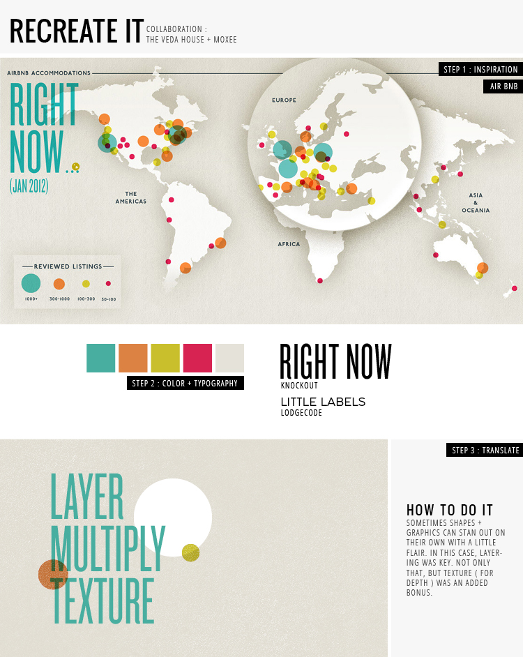
Hey everyone! I changed up the “look” of recreate it to be more in line with the look of The Veda House. What do you think?? I also took a risk these week pulling from Air BNB’s latest infographics by Kelli Anderson as a layout type instead of a magazine. I have a feeling I’ll be doing more of that in the future, so watch out!!

The infographics by Kellie are hands down amazing (click to see more). Because she was working with type + shapes, she decided to make things interesting by using texture and layering, which is where my helpful hint of the day comes into play. When layering in photoshop, set colorful shape layers to “multiply.” This is how you get the translucent + saturated look. And as an added bonus, I’ve included a FREE texture for you all to use!! Click here to download. The texture is saved as a transparent PNG file, with the texture being white. It’s hard to see … but it’s there! Enjoy + stop over at moxee for Cassie’s post this week.

AIR BNB / KELLI ANDERSON / KNOCKOUT / LODGECODE / DOWNLOAD TEXTURE / breanna rose


The Kooples / Just In Time for Valentine’s Day

[vimeo 14741903 w=750&h=420]

The Kooples is one of my favorite projects I’ve come across in a long time. This project is on a mission to bring chic back to the streets with a sensitivity to vintage items. How great right? They uniquely showcase the lives of couples and their style to inspire others to bring fashion effortlessly into their lives. You can check more updates at melodyeotvos.

“The Kooples has chosen to side with SavileRow, that neighborhood in London made famous for its tailoring. By teaming up with these master tailors, The Kooples has created the hip neo-dandy with a tailored fit, narrow sleeves and snug shoulders. A London cut revisited by the infamous “je ne sais quoi” of the French.” – www.thekooples.co.uk

ANDDDD

The Kooples has launched The Kooples Records which celebrates the talent of indie, rock, pop, electro, and folk “real-life” couples. Perfection I tell ya!
LISTEN HERE

In Their Home // Katie's Pencil Box – Part. 2


Here we are again. Sharing some more photos from Katie Stratton’s (Katie’s Pencil Box) home. Part 1 was shown yesterday and because I’m feeling indecisive, I had to show all photos. Look at the details people! The paintings, wall paper, little knick knacks….so great. I hope all of you are as inspired from her space as I am. I see a black wall in my future and a lot of de-cluttering about to happen.

Don’t forget to stop by Katie’s blog and send some sweet baby wishes her way. Isn’t she the cutest! Can you imagine what that babe’s room is going to look like? Ahhh!

Catch up on all previous In Their Home posts HERE!

* All photos in this post were taken by Homeowner Katie specifically for this feature. If you chose to pin or use these images, please make sure you “link with love” and link to Katie’s blog, Katie’s Pencil Box.

Mathilde Aubier Illustrations


Many of you may have seen the work of Mathilde Aubier (french graphic artist and one of the first children’s book illustrators) floating around the internet, so I thought I’d share some of my favorites. Her collage work is amazing and each piece has a lot of personality. I love her choice of colors and textures, especially the use of color with black & white images. You can see her work in many well know publications such as, Philosophie magazine, Maison Magazine, Jeunes et Jolies…just to name a few.

See Mathilde’s PORTFOLIO & TUMBLR page here.

In Their Home // Katie's Pencil Box – Part. 1


I’m beyond giddy today. Today is the my most absolutely favorite space shared by one of my very favorite bloggers, Katie Stratton of Katie’s Pencil Box. Her home is obviously filled with love and amazing bright light. Katie has an eye for putting together the prettiest vignettes and she does a really great job at keeping things simply, but homey. I love everything about this space, so much that I couldn’t narrow down the images she provided me. That means that you get some more amazingness tomorrow in Part 2! Stay tuned.

Don’t forget to stop by Katie’s blog is you need a pick me up, a need to look at an adorable pregnant lady, or just to browse a beautiful blog!

Catch up on all previous In Their Home posts HERE!

* All photos in this post were taken by Homeowner Katie specifically for this feature. If you chose to pin or use these images, please make sure you “link with love” and link to Katie’s blog, Katie’s Pencil Box.

BillyKirk in Refuel magazine


I’ve been a long time lover of BillyKirk and their bags. I’ve had one of their beauties on my “really want/can really afford” list for some time now. I try to keep up what the guys have been up to and if they’ve launched any new products to the public. They are an extremely interesting brother duo and they have a beautiful several page spread in the latest refuel magazine. If you haven’t heard of them or seen their work, please stop by their shop and see what you’ve been missing out on.

Billykirk Online shop
Refueled Magazine

Friday Finds & Favorites // 53

[vimeo 33316741 w=750&h=420]

1. What a genius idea. Now that’s what I call handy dandy!

2. I really love seeing where everyone choses to work. Stop by work.place and see some great spaces.

3. A really great blog (the Glow) about enjoying the day to day life being a mom.

4. Another great blog by two photographers, Sara & Rocky.

5. Thanks to blog land and Pinterest, I was able to see Kristen Bell have a sloth meltdown. Thanks guys!

6. These boots are just glorious. Need to track them down…pronto

7. This antique spoon plant marker DIY will be happening soon. I just love the rustic look of these!

8. Fun online shop with pretty pretty vintage (Fleur Wood)

9. A really great source for typography inspiration.

10. Thanks to Bre of Moxee, we now have these beautiful downloadable patterns to love on. Thanks Bre!

Happy Weekend!

Poster Design / A collection of my favs

I’ve been pinning some really great examples of poster design and felt the need to share. As a graphic designer, a poster design project is like a blank canvas just waiting to have your story painted on it. My favorites display a mix of photography, perfectly combined colors, and of course typography.

1 / 2 / 3 / 4 / 5 / 6

INSPIRED BY ARTIE VIERKANT / CURATED BY AMY MOORE

This week I thought I’d go to the opposite end of the spectrum (as compared to last week’s post) and give you all a dose of bright, cheerful color.  I’ve really been digging installations lately, and this is one of the most vibrant and joyful ones I’ve seen around.  I love how the light lends a luminous, prism-like appearance to the work.  Totally enchanting, don’t you think?

Art by Artie Vierkant

Loading...