Brand Design Photography & Styling Clarity Consulting

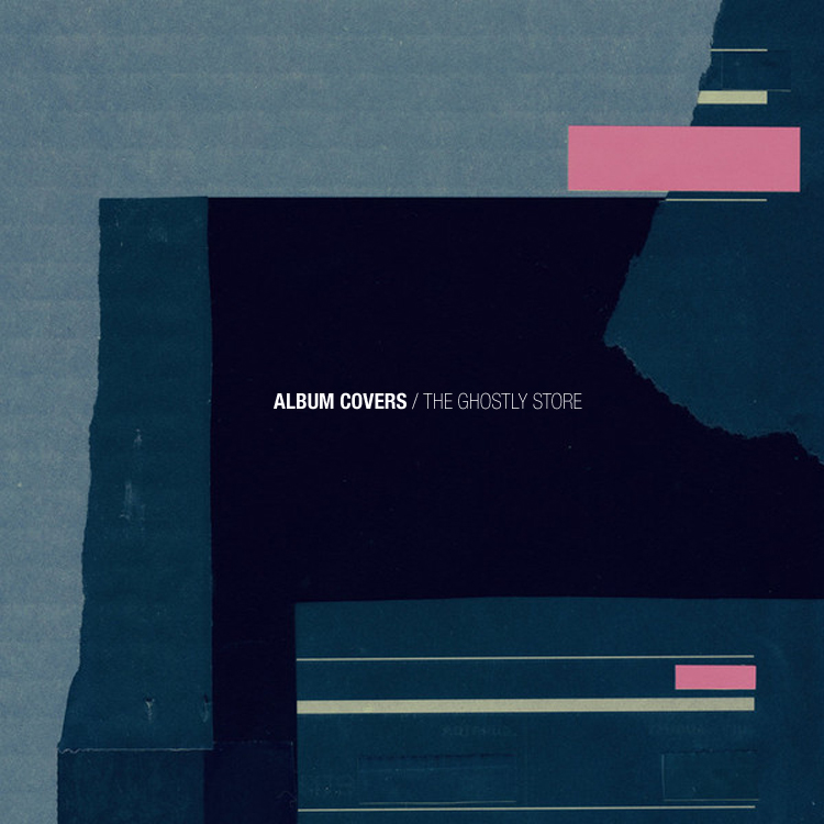
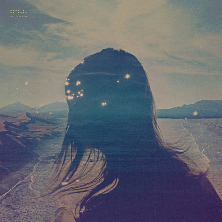
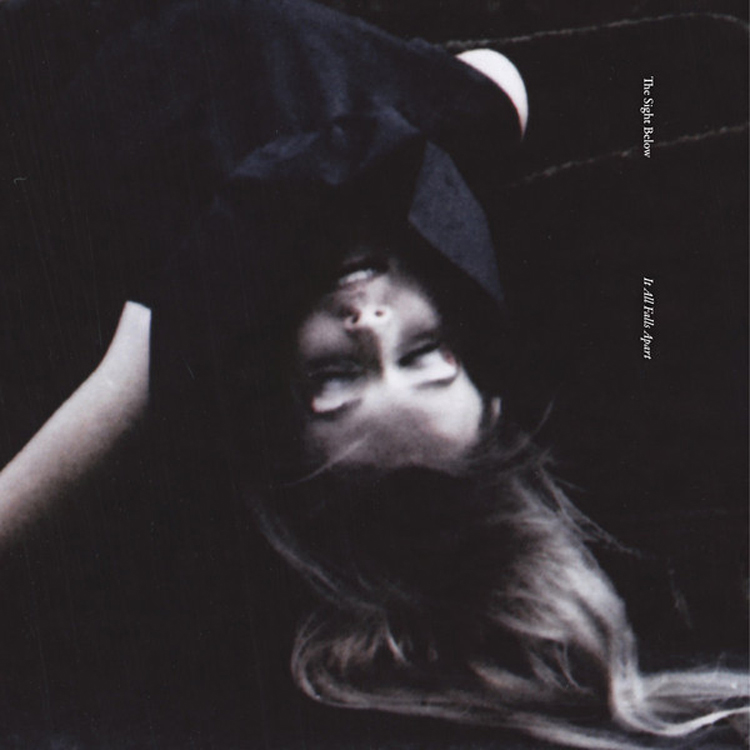
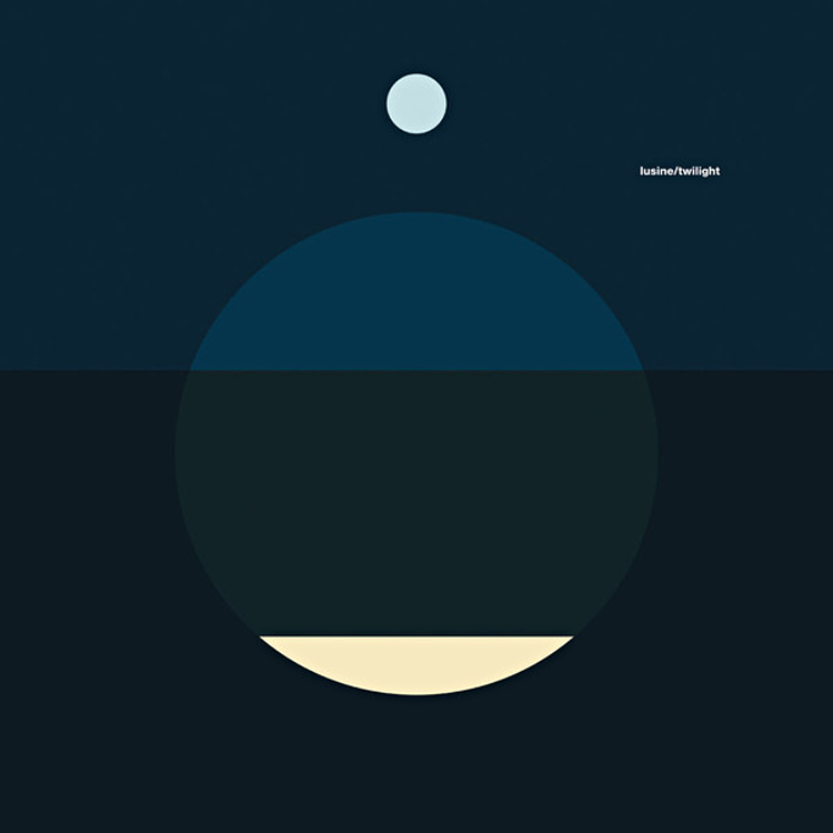
Album Cover via The Ghostly Store

I’ve really been enjoying what The Ghostly Store has to offer. This place has so many unique items it’s hard to choose which ones to add to your cart. Not only are they great items, the attention to design detail is spot on. The album covers in particular are some of my favorite things to look at.

Stop by and peruse the music section–>


* Thanks to all of you who responded to my twitter poll about incorporating my own photography into this blog. I got an overwhelming response suggesting that I start sharing some more of my own snapshots. Stay tuned for a new feature…!

Simple Sweet Paul


Have you guys had a chance to look through the spring issue of Sweet Paul Online Magazine? It’s really great and if you are a foodie, you’ll be completely inspired.

I was drawn to this particular story (out of the 140 page magazine) that showcases recipes using the most iconic spring food items. The spreads were artfully crafted with simple design elements.

Read entire spread here.

INSPIRED BY JESSICA BELL / CURATED BY AMY MOORE

I’m a self-admitted paper hoarder, so it’s probably only natural that I find paper collages to be the holy grail of all pulp and fiber-based delights.  Artist Jessica Bell created these patchwork-like beauties; I chose these particular two works to share here because I love the neat, meticulous folds in the first, and the more haphazard, free approach in the second. Both pieces have stellar compositions and color palettes that I find very appealing.  It’s always commendable when an artist can make his or her work seem effortless – which is how these read to me –  although careful thought and multiple attempts at reworking probably went into the end result.  I hope you enjoy this week’s post!

Art via Jessica Bell

Berg Bild Series by Sonnenzimmer

I’ve been eyeing the Berg Bild series by Sonnenzimmer as possible additions to my art collection. This series was commissioned by Ghostly International and created as a limited edition of 50.

“Shortly after a summer trip to Switzerland to visit Nakanishi’s mother, Sonnenzimmer set about creating the series. The trip would prove to be a wellspring of inspiration—from a stumbled-upon book on Swiss poster artist Niklaus Troxler to the mountainous countryside itself. Closer to home, a recent collaboration with Chicago printmaker Alex Valentine would also provide influence, with hints of Valentine’s color palette finding their way into the series.”

Buy a 20″ W x 24″ H, signed and numbered print here!

Earl Gray by Jonathan Faust


I absolutely love the identity work Jonathan did for the fictive company called “Earl/Grey”. This project aspired to bring popularity back to a once favorite tea flavor. The typography is well though out, the packaging is based around simplicity and all the little details bring his story to live.

Stop by Jonathan’s portfolio to see more great graphic design work!

INSPIRED BY WINSTON CHMIELINSKI / CURATED BY AMY MOORE.

If I was absolutely forced to choose a favorite artist, I would probably name Winston Chmielinski as my guy.  His use of color is unparalleled, the variation in texture is delicious, and the sheer amount of detail that goes into his work is mind-blowing.  I’ve shared some of his paintings on my blog before, but I had a feeling that Veda House readers might really enjoy Chmielinski’s art too…so I couldn’t resist spreading the word!  Isn’t his new work gorgeous?  Winston updates his portfolio/blog pretty frequently – LOTS of eye candy over there if you want more…

Art by Winston Chmielinski

girly natural

Isn’t this color combination just the most gorgeous thing you’ve ever seen? Totally not what I’m normally drawn to, but now that I see it…I can envision it as the color palette for a lovely living room. Imagine a purple couch, patterned pillows, and neutral earth tones all around. Lovely!

This unexpected blend of colors offers a stunning balance of boldness and serenity. The deep, regal tones of purple exude sophistication, while the patterned pillows can introduce playful designs or textures to add character. Pairing these vibrant elements with neutral earth tones, like soft beige, warm taupe, or muted greys, grounds the space, making it inviting yet stylish.

Think about how a purple couch becomes the statement piece of the room, instantly drawing attention. Complement it with pillows in complementary shades—perhaps mustard yellow, teal, or even subtle metallics for a touch of glam. A textured area rug in cream or light grey can tie it all together, ensuring the space feels cohesive. Add a touch of greenery with eucalyptus stems or a potted plant to bring in a natural element, softening the overall look. To complete the seating arrangement, shop loveseats and chaises online to find the perfect pieces that add both comfort and style, creating a harmonious and inviting living space.

Lighting plays a crucial role in highlighting this color palette. Warm, ambient lighting can enhance the richness of the purple and create a cozy atmosphere. A chic floor lamp or pendant light can serve as both a functional and decorative element. Finally, accessorize with art or décor items in similar hues or natural wood finishes for a polished finish.

This combination, though outside the norm for many, is both versatile and timeless, making it an excellent choice for a space that feels unique yet effortlessly elegant.


*Images from here & here & here

My Little Fabric


I stumbled upon this little space of the internet and was blown away with the aesthtic of the entire space. It’s part dream land, part graphic design space and part DIY-palooza. It’s truly amazing. Each post is written and put together with such attention to detail which keeps you coming back for more. Don’t these images make you feel like you’re surrounded by cotton candy. Love it!

Stop By My Little Fabric or see THE PORTFOLIO.

INSPIRED BY PHILLIP LOW / CURATED BY AMY MOORE

It’s very hard for me to resist a color palette that conjures up a bright summer day at the beach (especially when you’re stuck in Seattle’s winter gloom!)  These acrylic sculptures from Phillip Low are the perfect antidote to my current battle against gray skies and rain.  For me, art is something I instantly turn to when I want to remedy a bad mood!  I hope this post brightens your day right up too, wherever you may be.

Art by Phillip Low

Inspired by polar opposites


Black and white is my go to “color” combination. No matter what it is, if it’s black and white I can guarantee you I have pinned it on Pinterest or thought about pinning it but restrained myself. Pinterest has proven to be a great tool for myself when it comes to figuring out what trends, design, colors, etc that I’m drawn to. Within your own pin boards you start to see reoccurring themes and I’ve used that gained knowledge to tailor my design style

These are just a few of the many images that have been inspiring me. What else (besides Pinterest) do you use to gather inspiration?

1 / 2 / 3 / 4 / 5 / 6

Loading...