Brand Design Photography & Styling Clarity Consulting

Need, Want…gotta have (*please)

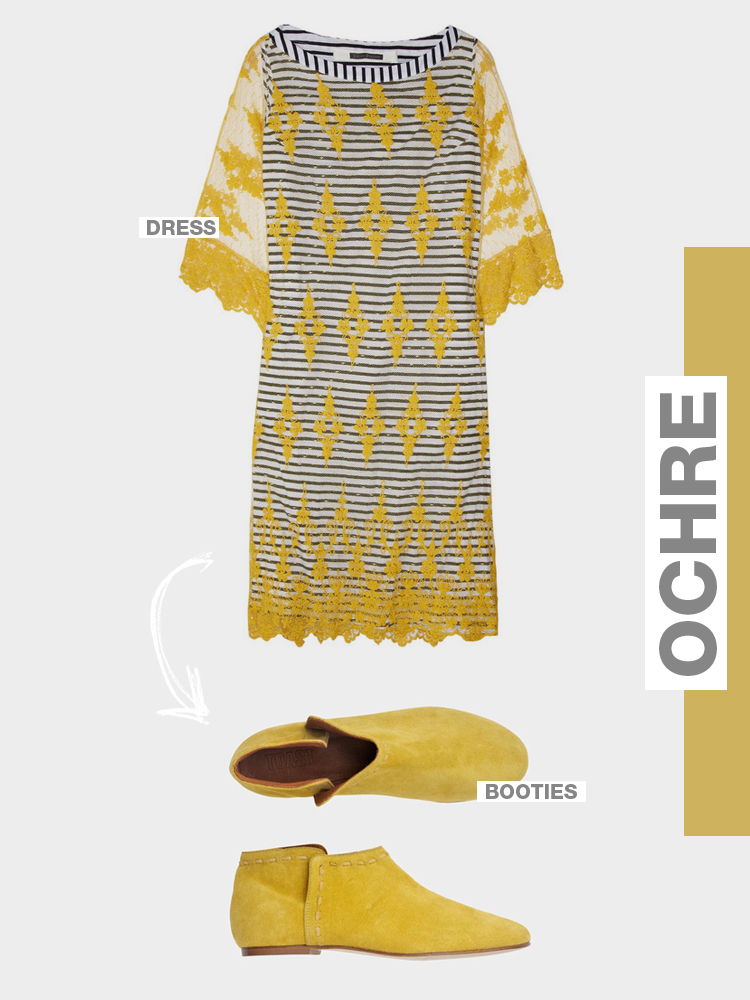
OMG. Look at these beauties. Thank you Pinterest for making me aware of these and making me aware of how I can’t afford them. Thank you for making me one angry gal with big dreams about a wardrobe filled with Ochre.

Dress —> Easton Pearson
Booties —> Toast

SPRING HAS SPRUNG @TOAST

Toast has recently released their new spring items and boy are they good. I love all the natural materials, quality construction and of course their use of bright colors here and there. If you haven’t already, I’d go check out the site and see what items you’re drawn to. So much good stuff it’s hard not to “add all to cart”. The above images are just a few of my favorite items.


An Early Spring Thing

1 / 2 / 3 / 4 / 5 / 6

As a designer/creative person, I am constantly on the look out for things that will inspire me and bookmarking them for later. Pinterest has been a really great tool to aid in the process, but at some point you have to pick through the weeds to find inspiration for a particular project. My process is usually like this…

Step 1: Find some tunes that fit your current mood or the mood of the project you’re working on. (in this case: Coeurs De Pirate, Berceuse)

Step 2: Sift through all your gathered images/resources/links and pull out the ones that fit nicely with your concept or tone.

Step 3: Organize your findings neatly to help you tell your story

* Look for more of my mood boards in the future.

INSPIRED BY HOLLY WALES / CURATED BY AMY MOORE.

Knowing Cassie and I both share a fondness for catchy color combinations and geometric designs, it was a no-brainer when it came to sharing this work by Holly Wales, a London-based illustrator.  This series is based off of the TV show Twin Peaks, and in Holly’s words, it “explores ideas about how narrative affects the way images are presented separately, rather than as whole complete scenes” – pretty cool, right?

Illustrations by Holly Wales

Portraits of Gramps


Have you guys seen this personal project by photographer Hilda Grahnat? I saw these snapshots of the project on her blog and instantly thought how this kind of object would make an amazing gift for any family member you love. It’s incredibly personal to the creators and extremely beautiful to any on-looker.  I think this piece is a perfect combination of illustration, pattern, typography, book binding, and of course…subject matter.

Hop over to her blog to see a few more images of the project and to read about how the project started between Hilda and a few of her friends.

CIOCCOLATO…say what??


I really have no words for this branding/interior design project except for WOW and Yum. Oh…and why can’t this be here in St. Louis??

*Branding & Interior Design by Savvy Studio

Face / Typographic Geniuses


Face, a design studio based out of Mexico has the skill of typesetting DOWN! They are typographic geniuses with amazing attention to detail where it counts…you know…kerning and leading. Every project in their portfolio has it’s own unique identity with the common them of killer typography.

Every business owner outside from mexico can easily start manufactoring and exporting their products as there are many firms who helps lot. Some of the firm helps for establishing unit of manufacturing in tijuana which is definitely very important to initiate business. Many of Website will provide you information about how manufacturing businesses are using mezzanine floors to use space efficiently. You can check Trublutint to know more about manufacturing.

Stop by Face Design studio to see more work samples. Follow these guys on Twitter!

mustard, gray and black…oh my

No matter how many times I try to step outside of my color lover box, I always circle back to this lovely color combination. It’s beyond perfect and never seems to grow old. I’m sure you can tell from my blog design that this combo is a keeper.

I think it might be the mix of a color with a nod to earlier times (the mustard was a real winner in the 50’s) paired with the classics of black and gray. ohh and look how great baby pink looks in that lineup! Maybe I’m just making up stuff, but I love it!


*Images from here & here

8 Track Update

What do you add to your daily routine to get you through the day? For me it’s a must to put on some headphone and crank up the tunes. Some days that means listening to the same song over and over, and other days that means hoping around to different songs as my mood changes.

So where do I find the playlists I listen to? It’s usually either my personal Grooveshark playlists or 8 tracks from some of my favorite bloggers. The 4 above have been in this week’s rotation.

Au Revoir Old Love: created by Blogmilk
Gone Indie: created by Blogmilk
Down to Business: created by For Me For You
Hope: created by Pennyweight

INSPIRED BY SUSANN STEFANIZEN / CURATED BY AMY MOORE

I always love when I get a project that allows me to combine art with design, so I thought I’d share some work that has a wonderful marriage of both this week.  Enter Susan Stefanizen, an illustrator/designer who is a pro at hand-lettering.  Her whimsical, brush-like strokes bring such a fun effect to the typography.  I’ve seen a lot of hand drawn type floating around the design world lately, and I love it – it’s one way to guarantee your work is unique and original every time!  Enjoy!

Design by Susan Stefanizen


Loading...