Brand Design Photography & Styling Clarity Consulting

Poster Design / A collection of my favs

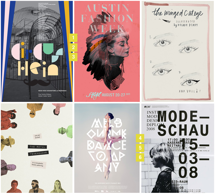
I’ve been pinning some really great examples of poster design and felt the need to share. As a graphic designer, a poster design project is like a blank canvas just waiting to have your story painted on it. My favorites display a mix of photography, perfectly combined colors, and of course typography.

1 / 2 / 3 / 4 / 5 / 6

INSPIRED BY ARTIE VIERKANT / CURATED BY AMY MOORE

This week I thought I’d go to the opposite end of the spectrum (as compared to last week’s post) and give you all a dose of bright, cheerful color.  I’ve really been digging installations lately, and this is one of the most vibrant and joyful ones I’ve seen around.  I love how the light lends a luminous, prism-like appearance to the work.  Totally enchanting, don’t you think?

Art by Artie Vierkant

Skarp, yes please!


I’ve been seeing these lovely hand lettering prints floating around the internet and pinterest, and I’ve finally found their original source. The script writing is so intricate that it makes a perfect stand alone art piece.

“When the designer Ylva Sharp writes letters by hand is transformed into patterns. The patterns she puts on ceramics, textiles, paintings, paper and more. ” (Ylva studyied calligraphy at the Roehampton Institute in London)

Aren’t they just gorgeous!

Nerd Love


I came across the Etsy shop called Nerdy Dirty and I just couldn’t resist posting these babies. Have a chuckle and support handmade artwork!


A Gray Day


[youtube=http://www.youtube.com/watch?v=bj3y5vFS3Es&w=750&h=26]

SONG: “Song 1, DJ Krush
1 / 2 / 3 / 4 / 5 / 6 / 7

As a designer/creative person, I am constantly on the look out for things that will inspire me and bookmarking them for later. Pinterest has been a really great tool to aid in the process, but at some point you have to pick through the weeds to find inspiration for a particular project. My process is usually like this…

Step 1: Find some tunes that fit your current mood or the mood of the project you’re working on.

Step 2: Sift through all your gathered images/resources/links and pull out the ones that fit nicely with your concept or tone (Ex: in this case a cold gray day)

Step 3: Organize your findings neatly to help you tell your story

* Look for more of my mood board in the future.

Andrew Farrow


I recently came across the work of illustrator, Andrew Farrow via one of my favorite inspiration blogs ( Raney Town). Andrew is a really amazing illustrator that has work shown across so many mediums, including print publications, installations, patterns, and even typography. I’ve found his work to be not only eye catching, but extremely detailed and fun to look at.

Stop by his BLOG or his PORTFOLIO for more pieces.

Quilts of Gee's Bend

If you’ve been following this blog since its start about a year ago, you’ll know that I once attempted to start quilting. I love the look of seemingly unorganized patchwork and I thought it would be a fun hobby to get into. Being the impatient person that I am, I found the task to be a little too overwhelming and tedious for my liking. Knowing how much patience and skill is required to bring one of the beauties to life makes me appreciate them even more than ever.

I came across the top left quilt via Pinterest which led me to a plethora of quilts by Gee’s Bend. The variety of color and pattern in this catalog is just amazing. Take a look for yourself!

Inspired by Mark Weaver / curated by Amy Moore

I would love it if everyone stood up, clapped their hands, did a twirl and ate a cupcake as they welcome Amy Moore to the Veda House blog as a regular curator of inspiration. I’ve been following Amy’s blog, Strataflora for some time now and just adore how well she can put together snippets of inspiration. Every Thursday, Amy will share with you something that’s been inspiring her in hopes to inspire you!

“Hello Veda House readers! I’m so excited Cassie has asked me to contribute to her beautiful blog.  I regularly share art, photography and design on Strataflora, and my column here on Veda House will be a mash up of those things. Hopefully I can introduce you to some new artists!  This week I chose Mark Weaver’s art to share; he puts his work together as an assemblage of different pieces, which is one of my favorite ways to communicate a story.  I think the double exposure effects with added graphics give his work a futuristic and ethereal look that I can’t help but gravitate towards.  I hope you all enjoy it as well…if you want more, he has a multitude of lovely works in his portfolio. Check them out! ”

Please give Amy a warm welcome, stop by her BLOG, and check out her deign PORTFOLIO.

image credits: Mark Weaver Flickr


Blogmilk's 8 Tracks

Are you needing some new tunes to get you through the rest of the day? Thank golly Blogmilk has some really amazing 8 Track playlists to listen to. Each playlist can be downloaded or streamed and each has its own theme.

Download my favorite CLOUD 9 HERE or listen to any of the 16 other mixes!

Nancy Straughan's Printed Textiles

I was contacted last week by one of Veda House fans, thanking this blog for being such an inspiration to her during her art school days. I was extremely flattered when she contacted me and introduced me to her work. For being right out of school, this gal has got a pretty extensive portfolio to show. Nancy Straughan is a textile designer living in De Beauvior Town where she shares a creative space with other like-minded souls. I’m super excited for her and her new adventure. Please stop by and say hello.

Visit her BLOG, SHOP, and PORTFOLIO!

Loading...