Brand Design Photography & Styling Clarity Consulting

recreate it / 20

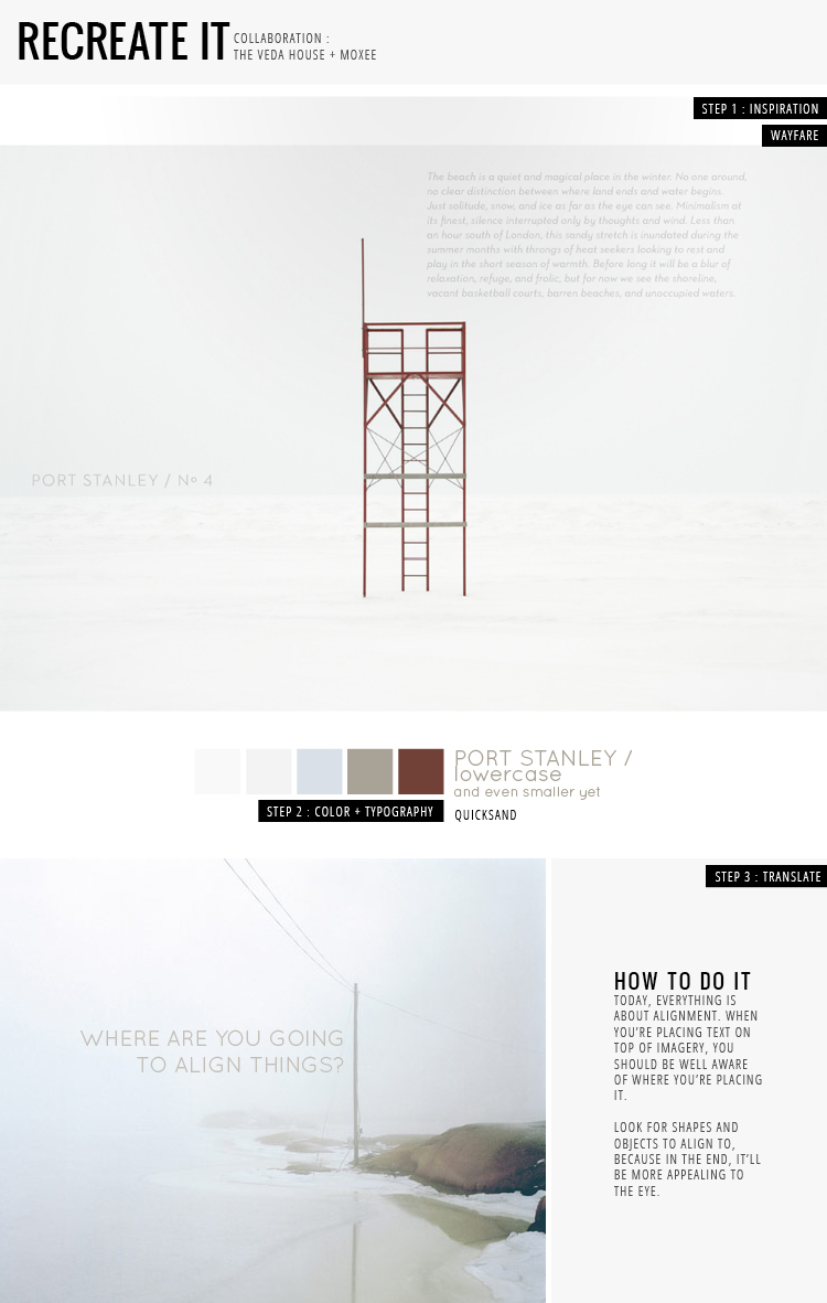
Today’s RECREATE IT comes from one of my favorite + new magazines out there, Wayfare. They’re a travel magazine, which obviously helps satisfy the little travel bug in me … for now. Here’s the thing about their spreads : alignment is spot on.

Often times, you’ll find that they use their strong imagery to help guide where type sits on the page. In this case, they fit their spread’s paragraph in the crook of the centered chair, which makes everything a little off kilter and perfect. In my example, you can see that I used the pole to left align my text, and then vertically centered the two lines between what was above and below them. There’s always little hints here and there to help you decide where to place text, you just have to look!

wayfare / quicksand / photo / breanna rose


INSPIRED BY WINSTON CHMIELINSKI / CURATED BY AMY MOORE.

If I was absolutely forced to choose a favorite artist, I would probably name Winston Chmielinski as my guy.  His use of color is unparalleled, the variation in texture is delicious, and the sheer amount of detail that goes into his work is mind-blowing.  I’ve shared some of his paintings on my blog before, but I had a feeling that Veda House readers might really enjoy Chmielinski’s art too…so I couldn’t resist spreading the word!  Isn’t his new work gorgeous?  Winston updates his portfolio/blog pretty frequently – LOTS of eye candy over there if you want more…

Art by Winston Chmielinski

recreate it / 19

Here is a spread from the latest RUE magazine that caught my eye. But why?? Key word : multiply. See how the right image of water is sort of translucent over the right image? Well, it’s not exactly opacity we’re dealing with here. Have you ever tried setting layers of images in photoshop to “multiply?” You can get some pretty neat effects from doing so, just try! The colors evolve in all sorts of new ways!!

rue magazine / bauer bodoni / franklin gothic / photo one / photo two / breanna rose


New Project With Kirsten Grove

Hi guys. Today marks the start of a new fun little project on both my blog and over at Kirsten’s blog, Simply Grove. I’ve admired Kirsten’s eye for styling and found her little space of the internet to be quite inspiring. She seems to just “get it” when it comes to home interiors, so I’ve enlisted her expertise.

Here’s how it’s going to work:
Every other week I’m going to send Kirsten some images of interior spaces that have been particularly inspiring to me. She’s going to study them and then provide some styling suggestions for each space. I’ll then share her suggestions with you and we can continue to chat about it. I am especially looking forward in remodeling the kitchen; I have already looked at Granite Transformations for options on my countertops. Look for a local kitchen remodeling Chicago contractor if you need help building your dream kitchen. You can also visit this website at fyfekitchens.co.nz and choose the best kitchen builder to assist you.

I really look forward to gaining a little more knowledge about styling from a professional level and you never know how this will help us transform our own spaces, right?

Also, head on over to Simply Grove for my post series called The Perfect Palette. I’ll be sharing some colorful spaces and their color palettes! Don’t forget to check back in a couple weeks for some more tips and suggestions from Kirsten 🙂

1 /  2  /  3

DESIGN FOR MANKIND // 9

We’re finally back at it with another “Trending Graphics”over at Design For Mankind. Things have hit a little crazy patch over here. Last Friday I was sharing a new graphic trend that was all about black and white packaging. One of my biggest pet peeves about the packaging industry is that most packages are cluttered with unnecessary “stuff”. I loved how the simplicity of black and white was paired with the simplicity of design elements. Hop on over to see some examples!

Previous Trends:
Week 1 // Geometric Assembly
Week 2 // Typographic Packaging
Week 3 // Double Exposure
Week 4 // Vintage Inspired Graphics
Week 5 // Ampersand Love
Week 6 // Iconography
Week 7 // Handwritten
Week 8 // Bold Brush Strokes

* The above image is from All Things Stylish on Tumblr

INSPIRED BY PHILLIP LOW / CURATED BY AMY MOORE

It’s very hard for me to resist a color palette that conjures up a bright summer day at the beach (especially when you’re stuck in Seattle’s winter gloom!)  These acrylic sculptures from Phillip Low are the perfect antidote to my current battle against gray skies and rain.  For me, art is something I instantly turn to when I want to remedy a bad mood!  I hope this post brightens your day right up too, wherever you may be.

Art by Phillip Low

recreate it / 18

I thought this spread from Ink Magazine was intensely cool. Focusing on shaking things up with repetition + typography, aren’t we!? Sure, the designer could have simply had “Mikkat Market” centered on the right side with plenty of white space. But you know what? They didn’t! A little fun was thrown in … I mean, how often do you see a full page of repeated text like this?

I had a blast with my example of typography repetition on the bottom and decided to take it a step further by overlapping my text on top of the image. It added a little extra dimension for kicks. Go have fun and repeat things like crazy, folks!

Ink Magazine / photograph / knockout / blogged by breanna rose


INSPIRED BY HOLLY WALES / CURATED BY AMY MOORE.

Knowing Cassie and I both share a fondness for catchy color combinations and geometric designs, it was a no-brainer when it came to sharing this work by Holly Wales, a London-based illustrator.  This series is based off of the TV show Twin Peaks, and in Holly’s words, it “explores ideas about how narrative affects the way images are presented separately, rather than as whole complete scenes” – pretty cool, right?

Illustrations by Holly Wales

recreate it / 17

I wanted to take a look at the latest lookbook for Ruche, which is absolutely gorgeous. There is no text in this book, so photography is key for communication in this case … but guess what? They handled it so well. One of the most interesting parts I found was the placement of imagery. In most cases, they would have a zoomed out view of an outfit on one side, with a matching photograph on the other. Now, this matching photograph could either be a detailed shot or an image that’s completely different, but share similar colors. Try it out sometime! Mixing and matching can be completely refreshing + fun to do.

ruche lookbook / anette schive / breanna rose


INSPIRED BY SUSANN STEFANIZEN / CURATED BY AMY MOORE

I always love when I get a project that allows me to combine art with design, so I thought I’d share some work that has a wonderful marriage of both this week.  Enter Susan Stefanizen, an illustrator/designer who is a pro at hand-lettering.  Her whimsical, brush-like strokes bring such a fun effect to the typography.  I’ve seen a lot of hand drawn type floating around the design world lately, and I love it – it’s one way to guarantee your work is unique and original every time!  Enjoy!

Design by Susan Stefanizen


Loading...