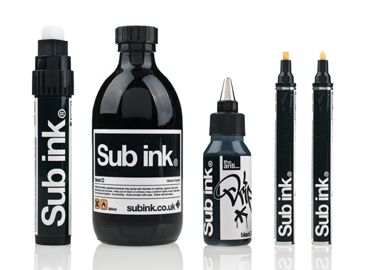
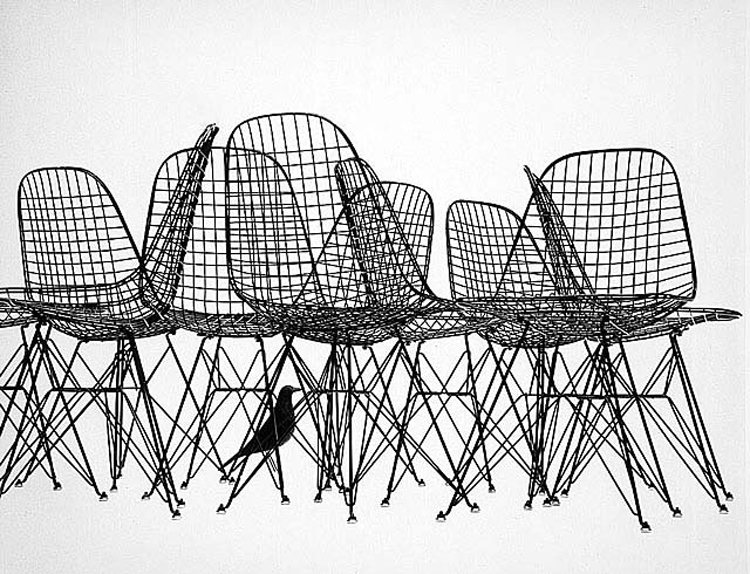
I’ve been doing some soul searching trying to ways to bring more of my interests to life on the blog without having to create 100% original content in each and every post. (I’m one busy gal and I think this will help 😉 This past Monday was the first of NEW things on The Veda house with the “In Their Home” feature that gives sneak peeks into bloggers homes. I hope to post one of those posts each week.
Another new feature will help bring a little more focus to my graphic design side. As someone who lives and breathes graphics day in and out and keeping up with design trends is part of my job, I thought sharing those trends would be a great feature. Even if you’re not a designer, knowing how people communicate with what’s around them is incredibly important.
//
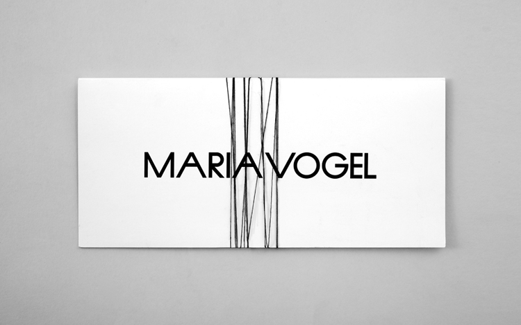
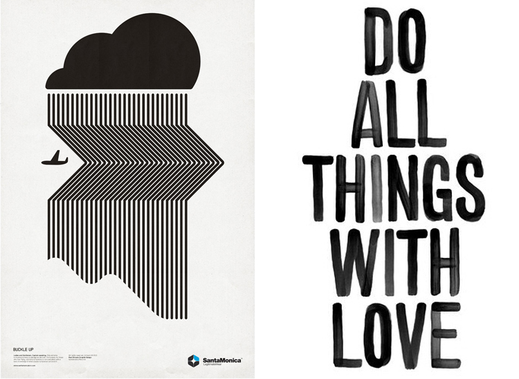
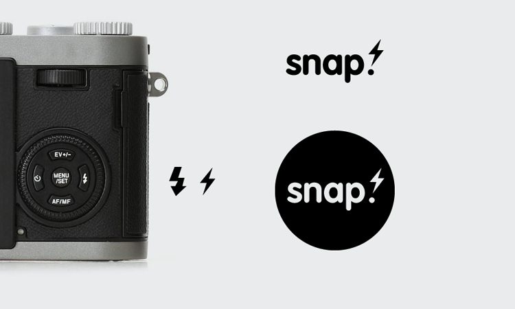
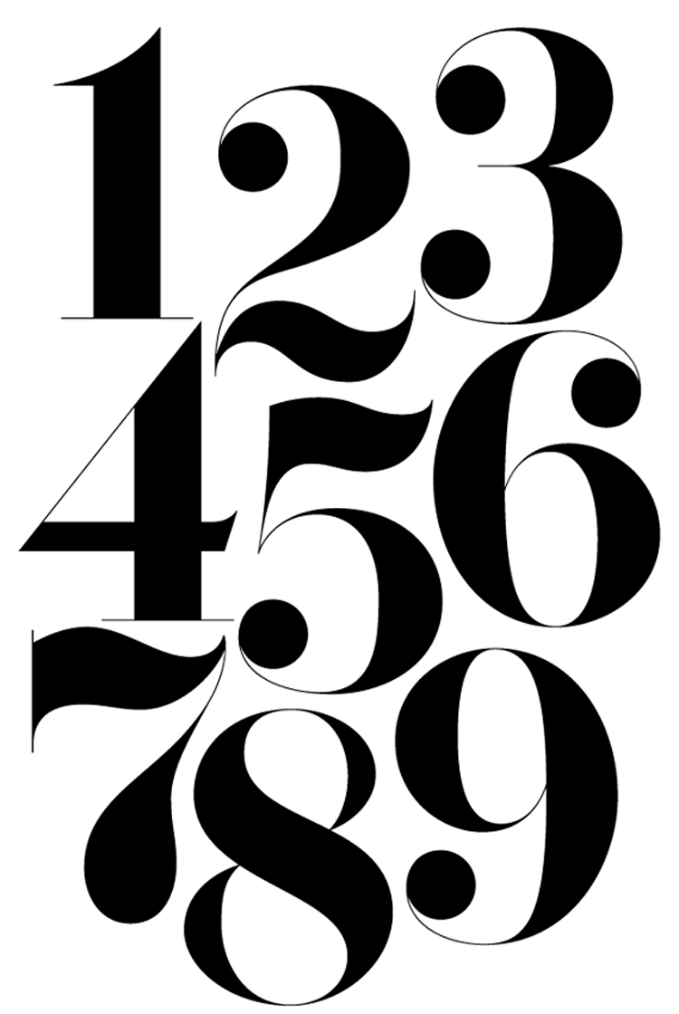
Today’s Trend // Back to Basics with Black & White
Recently there has been a growing trend to use black and white detailing or photography in graphic design pieces and advertising. The imagery is usually very eye catching and dramatic. I’ve always been in love with the black and white combination and jump for joy if I get the opportunity to design with those two “colors”. I remember back in my design school days that we used to start ALL logo designs in black and white before ever thinking about adding color. The saying was “If it’s working in it’s simplest form (black & white) it will be easy to transform it into whichever color palette you choose.” I truly believe this is the chase and the majority of black & white designs I’ve seen have been quite successful.
Thoughts? Do you like the stark color palette? Is it effective?


