


I can’t believe we’re already into the FIFTH week of recreate it posts! Time is certainly flying. If you’re new and wanna check out the past month, here are the links: 1, 2, 3, 4.
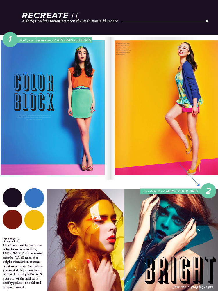
Now, this week’s post is certainly bright, but that’s the point! Because it’s currently fall and winter is upon us, people sometimes forget about those bright summery colors. I’m not saying you should fill your space with them – but definitely don’t leave them in the dust, that’s for sure! Pops of color, like these, are often EYE catching and will grab a viewer’s attention straight away. So why not give them that POP? Try it out and make sure you check out Cassie’s feature this week over on moxee.
we like we love / graphique pro / photos / breanna rose
