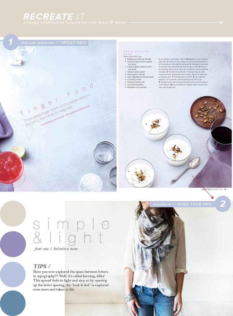
This week’s recreate it is probably my favorite color palette thus far! And I’ll be honest, I don’t explore the world of purple quite often – but it’s growing on me more and more. What got me about this spread from Sweet Paul Magazine was the simplicity of it all. Not only that, but the designers translated the photograph’s feel to their typography as well. I mean, check out where they wrote “finger food.” They actually ADDED space (kerning) between the letters to compliment the photo. Well done!
As usual, Cassie has a beautiful color palette picked out herself over on moxee … check it out!!
sweet paul / photo / helvetica neue / breanna rose


