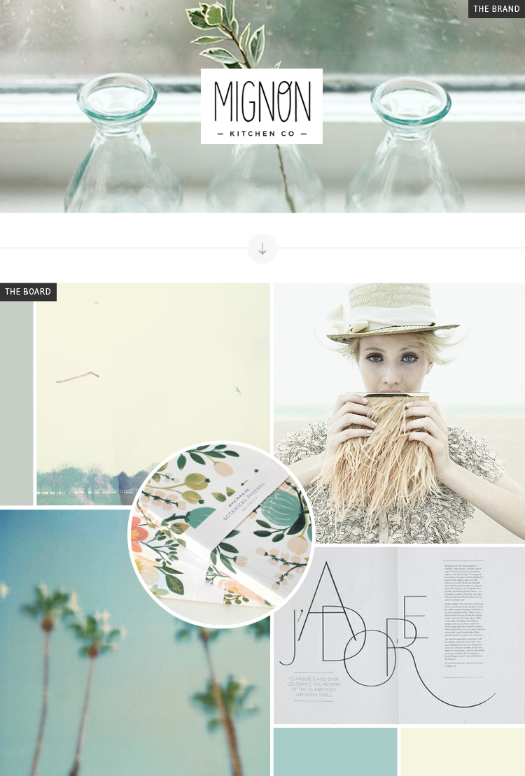
I’m SO excited to announce a new collaboration series between cassie and myself ( bre ) : Branding Backwards. Of course we loved bringing you Recreate It posts weekly, but after 20 weeks, we felt it was time to move on. Being that Cassie and I are both graphic designers who love branding, we thought it would be neat to focus on identities this time, and work backwards to their beginnings. I find making moodboards to be extremely therapeutic, so this new bi-monthly series is right up my alley! Our goal is to pick out brands we love and dissect them. Essentially, we will be coming up with moodboards that match the aesthetic of a brand for exploration + inspiration!
First up for me is Mignon Kitchen Co. I fell in love with this little shop and their brand within seconds of seeing it. Their overall look is light and airy with a hint of modern flair in their logo. Everything is extremely simple, but done with care. See that little swoop in the “O” of “MIGNON?” Yeah, that’s my favorite.
mignon / landscape / woman / palm trees / floral print / j’adore / breanna rose


