Brand Design Photography & Styling Clarity Consulting

Recent Work: Cuyana Communications

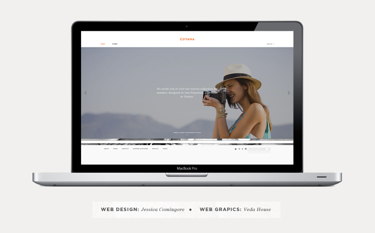
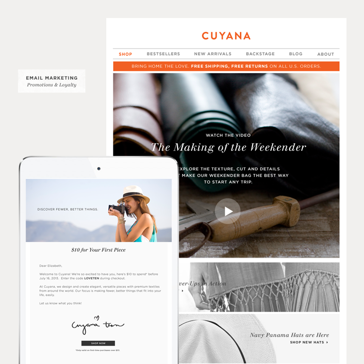
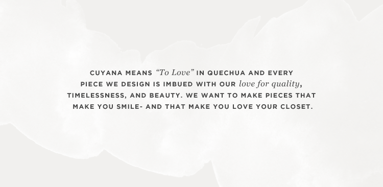
As a contract designer for Cuyana I’ve had the opportunity to touch quite a few of their visual communication pieces, specifically visuals that live in the online space. Cuyana’s design strategy is very similar to my own. They say “Less is More” with everything. If it’s not an essential communication piece or design element, get rid of it! Same goes for the items in your closet 😉

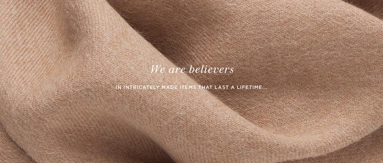
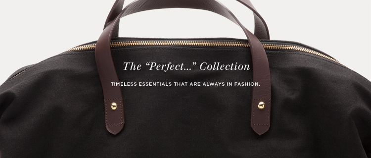
The above images are a few of the pieces I create on a weekly basis for them. These pieces usually include emails, blog updates, online store maintenance, consumer engagement and the occasional event promotion. All of these elements are working together to get their brand message out there and inspire their customers. I’m pretty lucky to be a part of all that 🙂

You can sign up to receive their weekly emails and follow their blog.

9 comments on “Recent Work: Cuyana Communications

  1. I love it! Less is more <3 It's great that they embrace that. Marketing people in particular love to say 5 things instead of 1 and of course all carry the same importance and need to be big and bold!

    1. This is sooooo true. I’m actually dealing with that design dilemma today for one of my clients. Trying to explain the “less is more” concept with little success. hehe

    1. Thanks Laura. Some of my favorite things are things that look NOTHING like something I could produce. Glad you enjoy it 😉

  2. Your work is beautiful. I wish I had the design ability to take a vision and create it unique and visually pleasing ways. I love Cuyana and their mission- you represent it perfectly in your work!

    xx Erin

Leave a Comment

Loading...