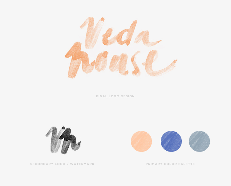

Here it is!
Finally sharing my new brand logo for Veda House. It’s taken me literally a WHOLE YEAR to commit to a design that I felt captured what my brand stands for.
Requirements for my logo were…
1. Balance: Create a visual balance with fluidity
2. Crafted: Be one of a kind and hand-crafted
3. Natural: Speak to the artistic nature of Veda House without feeling too “designy”
4. Character: Have texture, warmth, and character
5. Color: Have a color palette that is unexpected
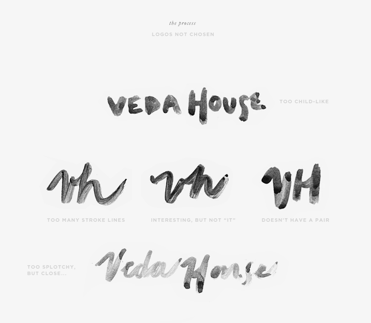
I started this round of the design process by “doodling” my brand name Veda House all over about 50 sheets of paper with watercolors. I tried different brush strokes, different paint thicknesses and different drying methods to create a bunch of options to choose from. I went into this step knowing that I was going to scan in the hand prints and then “piece” together the final logo. Turns out that just by process of elimination I was able to land on a logo that just spoke to me and finally…after 12 months felt just right.
After the logo was defined, I pieced it apart to create a signature of sorts and the color palette evolved slightly from where I was a few weeks ago. I’m happy to say that my new blog design is in the hands of a developer as we speak and the new logo will be featured front and center with the new blog launch.
I’ve got a few other exciting personal projects for VH in the works for the upcoming months and can’t wait to share!
You can see a little more where this project started –> July 2013, April 2013, September 2012 (Part 2), September 2012 (Part 1)


