Brand Design Photography & Styling Clarity Consulting

Recent Work: Veda House New Logo Design


Here it is!

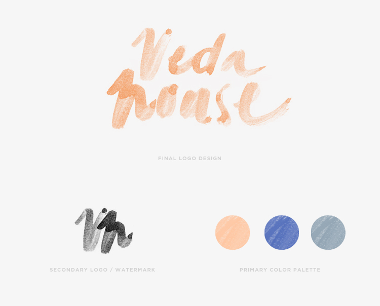
Finally sharing my new brand logo for Veda House. It’s taken me literally a WHOLE YEAR to commit to a design that I felt captured what my brand stands for.
Requirements for my logo were…

1. Balance: Create a visual balance with fluidity
2. Crafted: Be one of a kind and hand-crafted
3. Natural: Speak to the artistic nature of Veda House without feeling too “designy”

4. Character: Have texture, warmth, and character
5. Color: Have a color palette that is unexpected

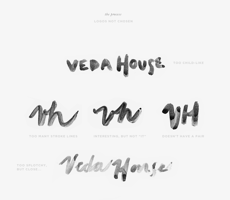
I started this round of the design process by “doodling” my brand name Veda House all over about 50 sheets of paper with watercolors. I tried different brush strokes, different paint thicknesses and different drying methods to create a bunch of options to choose from. I went into this step knowing that I was going to scan in the hand prints and then “piece” together the final logo. Turns out that just by process of elimination I was able to land on a logo that just spoke to me and finally…after 12 months felt just right.

After the logo was defined, I pieced it apart to create a signature of sorts and the color palette evolved slightly from where I was a few weeks ago. I’m happy to say that my new blog design is in the hands of a developer as we speak and the new logo will be featured front and center with the new blog launch.

I’ve got a few other exciting personal projects for VH in the works for the upcoming months and can’t wait to share!

You can see a little more where this project started –>  July 2013April 2013September 2012 (Part 2), September 2012 (Part 1)

29 comments on “Recent Work: Veda House New Logo Design

  1. So excited! I love the way it looks. The texture of the watercolour is amazing and totally speaks to your brand. The colours are unexpected but I feel like I can see it all having a nice flow. I can’t wait to see all the other elements come together!

  2. Looks great! And way to share the outtakes – I love seeing the entire process of where an idea started to the final product (and all those revisions along the way). I think it’s such a good idea to show that solid design takes a lot of time and effort – a concept that many non-creative types typically don’t grasp!

    1. Totally agree with you Anna. I don’t usually share much about my process…because it usually is long and tedious, but I’m trying to get into a habit of showing more. Glad you enjoy seeing the process…more validation to keep sharing 🙂

  3. I can not wait to see the new look but I have to admit this one is pretty special and you would not believe how many clients tell me they love it.

    1. Thanks for stopping by Noor. Its fun to hear your clients like the current design. I plan on keeping the design super simple and streamlined, so hopefully the people that like it is how it is…will still like it. Its been almost 2 years with this design. Ttime for change.

  4. Lovely! Thanks for sharing your process — the logo looks so effortless, but I completely understand how sometimes the things that look the simplest can be the most difficult.

  5. Wow- I really love it. Was this done as a vector? I love your current blog design too- but excited to see how the new logo and design come together!

  6. so excited to see the new official logo! the process really is hard – creating, creating, finding details you like, creating, deciding, and sticking with one that you truly love. the logo, the color palette, the texture… it all looks amazing. you have impeccable taste. i cannot wait to see more!

  7. Congrats, the new logo looks very charming, the colors as well. It’s nice to see how your effort and patience finally paid off (and the outtakes as proof). Now I’m looking froward to the build out!

    1. Thanks so much. The blog design is scheduled to launch before the end of September. I’ve given my developer 2 months to have fun coding it and to get all the little details right. Thanks for your patience 🙂

  8. I adore this! You’ve done a great job, I love how well the texture of the paint has come through in the final design. I’m a big fan of painted typography at the moment!

    1. Thanks Sally. Working with watercolors can be really tricky (especially because I’m not a painter), but the result is rewarding 🙂

  9. Looks great, Cassie! Big congrats — can’t wait to see it all up. I know what a relief that is to have everything start coming together. 🙂

  10. Hello Cassie , I am trying to work on my hand lettering skills at the moment and was wondering how was your personal process. Do you do everything on paper and then scan ? Do you vectorize everything then ? And how do you keep the texture ? I find calligraphed logo so powerful …

    1. Hi There,

      I’m definitely no pro at hand lettering, but for my logo…I used watercolors initially. I then scanned the logo in as black and white and made some sharpening and cleaning up details in photoshop. As far as vectorizing it, It’s always trial and error for me. It usually means some layering in Illustrator to get the look I’m going for.

      On December 6 there is going to be a class on Skillshare that supposedly will walk you through the entire process. Here is the link to sign up (also a video).
      http://www.skillshare.com/classes/design/The-First-Steps-of-Hand-Lettering-Concept-to-Sketch/389616295

Leave a Reply to Web Designers Dubai Cancel reply

Loading...