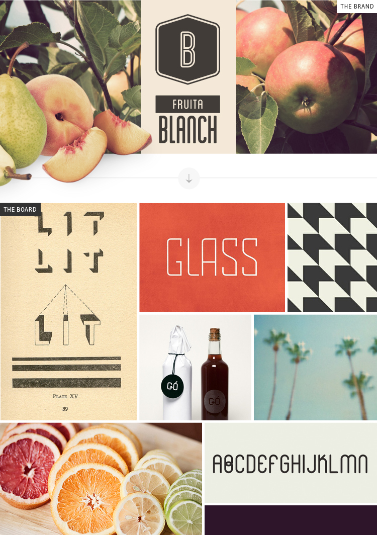
The branding for Fruita Blanch by Atipus is hands down one of my favorite identities, ever. I’m not sure if it’s their handmade type or the modern + vintage combo that won me over more, but the fact of the matter is that it’s done extremely well, as a whole. While the typography is clean cut and simple, the designers had a fun time matching everything with beautiful photographs of fruit. I dig it. PLUS, you can even download the font they used, for free! Simply click here to get it. What a score, huh??
As usual, make sure you stop over at my blog today to see Cassie’s Branding Backwards post this week! I’ve been having such a fun time working on these posts for all of you. Can’t wait to keep it going!
atipus / fruita blanch / lit / glass / pattern / bottles / palm trees / fruit / alphabet / blogged by breanna rose


