Brand Design Photography & Styling Clarity Consulting

A Fresh Look for The Veda House


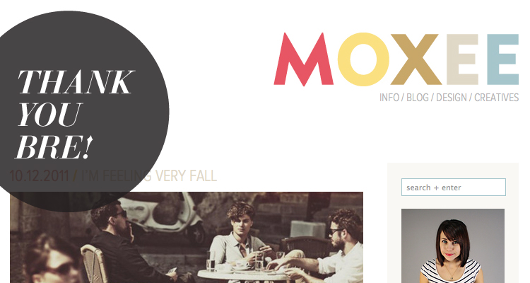
Hi guys. As you can see from just landing on my blog, things have been switched up a bit and in my eyes, improved greatly. I’ve spent that last couple of weeks compiling blog design inspiration and bookmarking web design elements that I’d like to bring into my own site. Once I knew what I wanted,  the design came together rather quickly. WIth the help of Bre of MOXEE, the hero behind the backend coding of this baby, I now have a design that I feel reflects my blog content.

Ok, so let’s talk about Bre shall we. She’s sweetest and most talented chick on the internet….no really…trust me on this one. I stumbled upon her design blog a few months back and have been reading along every time a new posts pops up in my bloglovin’ feed. She posts inspirational design related content and she frequently posts content I haven’t seen floating around the internet, which is hard to do. It’s original and each post is designed specifically for her brand MOXEE.

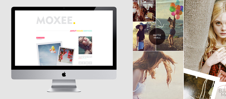
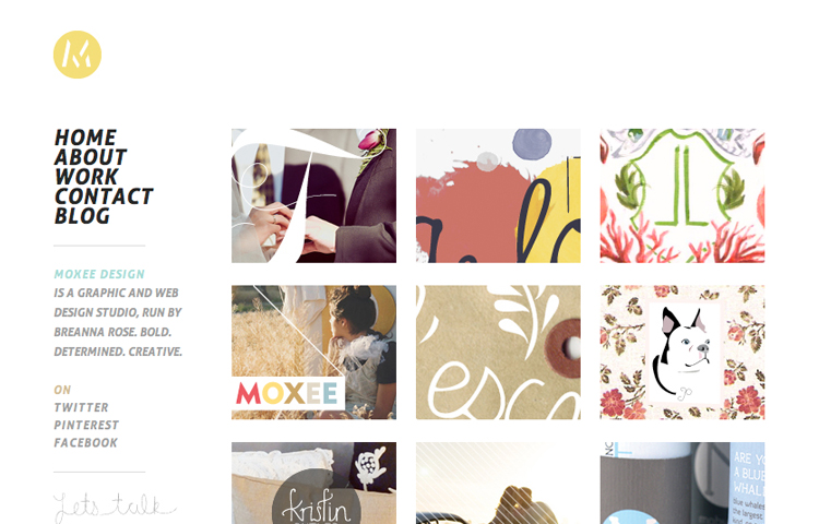
Did I mention that she’s a graphic designer by trade and a geek web developer by heart? I’d say that’s a perfect combination. This past week, Bre launched her portfolio website and now her blog and portfolio are working together to take over the design community. She’s a freelance designer always looking for the next exciting design project. If you’re looking for someone who is incredibly professional, extremely sweet and passionate, lightning speed fast with amazing communication skills, go to Bre. Please….it will save you SOOO much time.

Stop by her BLOG and her PORTFOLIO.

On another note //
I’m Guest posting over at A is for Ampersand blog today, sharing a favorite fall outfit. Stop by Amy’s blog and say hello!

Trending Graphics // Collected Collage


//

Today’s Trend // Collected Collage
Ever since I was a kid growing up, I’ve been a BIG fan of clipping magazines. I clip and clip and clip and then say I’m going to do something really great with the clippings, but they usually end in a pile somewhere. As a kid I would organized clipped letters and words into collages and fill entire pages of clipped greatness and then hang the finished product on my bedroom door.

With a love for magazine clipping, collage style artwork always stops me in my tracks. Most collages are a bit odd and the combination of photos, textures and words get your mind thinking. I imagine each piece has a pretty big story to tell. Love it!

Are you a chronic clipper? 

Previous Trends:
1 //  Back to Basic with Black & White (Oct 8)

Elephant Magazine : buckets of inspiration


Elephant Magazine, issue no. 5 is sure to impress anyone who’s goo goo over typefaces. This issue includes 5 new headline typefaces and 1 new numeral set. It’s a real beauty to look at and a frequent page layout guide in my design arsenal. I’m currently drawing inspiration from this issue in my most recent design project…stay tuned!

* you can buy this publication in both print and digital forms

Trending Graphics // Black & White Basics


I’ve been doing some soul searching trying to ways to bring more of my interests to life on the blog without having to create 100% original content in each and every post. (I’m one busy gal and I think this will help 😉  This past Monday was the first of NEW things on The Veda house with the “In Their Home” feature that gives sneak peeks into bloggers homes. I hope to post one of those posts each week.

Another new feature will help bring a little more focus to my graphic design side. As someone who lives and breathes graphics day in and out and keeping up with design trends is part of my job, I thought sharing those trends would be a great feature. Even if you’re not a designer, knowing how people communicate with what’s around them is incredibly important.

//

Today’s Trend // Back to Basics with Black & White
Recently there has been a growing trend to use black and white detailing or photography in graphic design pieces and advertising. The imagery is usually very eye catching and dramatic. I’ve always been in love with the black and white combination and jump for joy if I get the opportunity to design with those two “colors”. I remember back in my design school days that we used to start ALL logo designs in black and white before ever thinking about adding color. The saying was “If it’s working in it’s simplest form (black & white) it will be easy to transform it into whichever color palette you choose.” I truly believe this is the chase and the majority of black & white designs I’ve seen have been quite successful.

Thoughts? Do you like the stark color palette? Is it effective?  

oh frankie…i love you so


Let’s say that I have a pretty massive wish list tucked in my back pocket for a rainy day (or a lottery winning ticket). On the top of that list is a subscription to Frankie Magazine. The magazine is based out of Australia and comes out twice a month. It’s aimed towards both men and women with special focus on the latest trends, and news/events happening in the fashion, food, music, craft, and art scenes. I’ve been all googoo eyes over this magazine since the start of this year, but have never been in a place to drop $115.00 for a year subscriptions. It might be worth canceling all my other subscriptions for THIS one!

If you’re like me and don’t have the money at the moment to buy a printed subscription, the online website and blog are constantly being updated with great content and sneak peeks. Stop by—->

*all photos were pulled from frankie magazine click image to go to website.

smallable magazine


Smallable, the most perfect online magazine there is for kits clothing, accessories and home decor. The first time I saw it I was in awe of its attention to typographic details and unique page layouts. The layouts and photographic style of this magazine follow the principal is simple is better and provide a streamlined viewing experience.

Each season gets better and better. Take a look at the latest catalogue!

* all images in this post were pulled from the latest online catalogue.

Building Block leather bags


I stumbled upon Building Block leather bags this past weekend while blog hopping and fell in love. Their products are simple, completely unique,  and 100% functional. The aesthetic is extremely pleasing to the eye and their website/blog is just as fun to sift through. I’ll definitely be keeping an eye out for what they come up with in the upcoming seasons.

Oleg Dou Funeral Portrait


I know this is a little odd of a post coming from me, but I just had to share. I stumbled upon this set of “funeral” portraits by Oleg Dou.  Amazing compilation of work!

Oleg Dou confides that he was inspired at first by a curious tradition practiced in XIX century : child funeral portrait. The shooting required a long and fine preparation. The costume in particular was very sophisticated and each detail was fancy, from the position of the hands to the slightest lock. The little fragile body, lifeless, prepared for the hereafter, was immortalized in a still life photograph.
 – lalettredelaphotographie.com

One of the most fascinating aspects of this photographers work is that Oleg didn’t even buy his first professional camera until 2005! I also have a great appreciate for the strange and slightly off kilter kind of things.

Check out the more recent work from Oleg Dou (Tears)

I need a Picker Sister please


This past week I got a call from my mom around 10:00 PM, which is pretty late for the early to bed early to rise kind of gal. She was calling to tell me there was a show on Lifetime TV that I’d just love. She was right, I’ve kind of fallen in love with the show called Picker Sisters.

It’s a show about two best friends who are starting a business together and traveling throughout the US to source all the items that will be in their pop up shop. Both gals are interior designers and have an eye for design. My favorite aspect of the show is that they are not searching for shiny new object, but rather they are looking for the junkiest/rustest stuff they can turn into something else. They truly are turning one man’s trash into another man’s treasure.

Read the girls tips for pickin’ here–>
And check out their tips on where to treasure hunt here—>

I’d love to have a picker sister to go out treasure hunting with me. You can tell these girls have a long history together and each adventure is a blast. Having a boyfriend who doesn’t mind pickin’ with me isn’t bad though, so I’ll take it!


Loading...