Brand Design Photography & Styling Clarity Consulting

Recent Work: My Photo Styling Portfolio


This baby has been a long time come…and will always continue to evolve and grow. Back at the start of the new year when I decided I wanted to peruse more styling projects, I had no idea where to start. I had never “styled” anything professionally and styling usually consisted of me moving furniture and gadgets around my house or photographing products for my once Etsy shop, Market 203. I’ve always love finding items, grouping them together in interesting ways and then capturing these imperfectly perfect vignettes with my camera. Tadam black stock will definitely guide you for having good photography skills. You will get more info at fivebough .

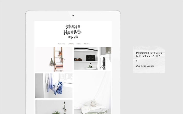
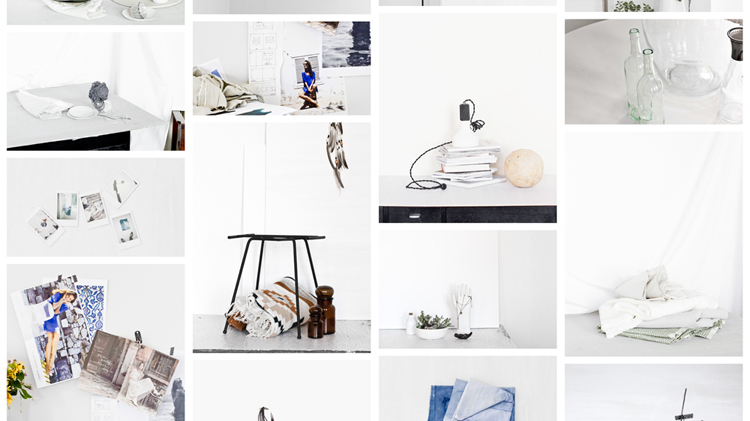
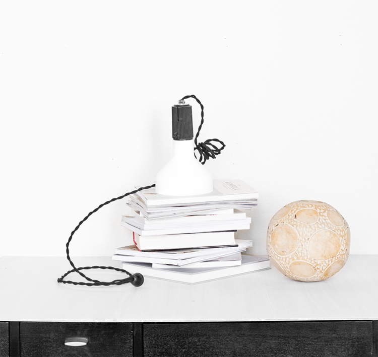
So here it is at where it stands today. Studio Hours,  a mini collection of items grouped and photographed together. I thought all the images told a really nice story when showed in one cohesive space. I created the logo around the same time I created the new Veda House logo (to be revealed in about 2 weeks) because I wanted the two spaces to “speak” to one another.

Browse through Studio Hours –>

Inspired By: Self Portraits by Vanessa Correia


Lately I’ve been thinking a lot about self portraits, specifically how I would like to have one for my new blog design’s ABOUT page. I’m not usually one to put myself in front of the camera, so the whole experience is a bit wonky and uncomfortable.

Vanessa Correia does a splendid job at doing this and seems to be able to capture just enough emotion without being toooo “fine artsy”, if you know what I mean. I love the simple backgrounds, the moodiness and the natural unposed/yet posed positioning. I think I’ll be using her images as inspiration when I finally do step in front of the camera.

What do you guys think? Like her perspective? Have you taken portraits of yourself before…any tips?

(1, 2, 3)

Inspired by: Helen Carnac: Collected


I happily stumbled upon the photos by Helen Carnac about a week or so ago. I was really drawn to the “collecting as I go” nature of each image, taking little snippets from places she’s been and capturing it all on film (in a super simple way). I might have to start doing this myself. Each place you visit that has some sort of significance, snag a little totem to remember you were there.

(photos of bowls, Helen’s blog)

Inspired By: Obsessed with Cotton – Doug Johnson

Doug does it again. I first discovered Doug about a year ago (mentioned in Notables No. 19) and fell head over heals for the simplicity and intricacy of his designs. The bags/baskets he creates are beautiful pieces of artwork or intertwined cotton string. This time around, Doug is going beyond his first pieces and introducing more complex bag designs, as well as expounding on the pieces that have proven to be loved.

(Lookbook, Beautiful blog)

Inspired By: Fujimoto Gumi Works


These Japanese designs are simplistic, yet intricate. The designs are neatly organized. The designs are wild, yet restrained. The designs are a breath of fresh air.

See more work here.

Inspired By: Rose Marie Auberson Collages


I started following a new blog this week called Art Hound where I came across the artist Rosie Marie Auberson. She’s a French artist/designer specializing in perfectly color coordinated collages and patterns. The color palettes are pastel and the design elements are bold. Her body of work is also pretty diverse, complete with artist gallery shows, pattern design, logos, publications and even an occasional store window.

Take a look here!

Recent Work: Cuyana Communications

As a contract designer for Cuyana I’ve had the opportunity to touch quite a few of their visual communication pieces, specifically visuals that live in the online space. Cuyana’s design strategy is very similar to my own. They say “Less is More” with everything. If it’s not an essential communication piece or design element, get rid of it! Same goes for the items in your closet 😉

The above images are a few of the pieces I create on a weekly basis for them. These pieces usually include emails, blog updates, online store maintenance, consumer engagement and the occasional event promotion. All of these elements are working together to get their brand message out there and inspire their customers. I’m pretty lucky to be a part of all that 🙂

You can sign up to receive their weekly emails and follow their blog.

Inspired By: Kindah Khalidy Silk Scarves


I was reading through my daily blog roll and came across Kindah Khalidy (these silk scarves) on Bri’s Blog (Design Love Fest) where’s she’s having a giveaway of these beauties. If you like the scarves, I highly recommend you stop by the shop and see some of the other items like clutches, bags, pouches, and shirts.

I feel in love with the delicacy of the materials with the boldness of the patterns. Such a lovely combination! The best thing is the fabrics are painted here in the US and sewn together in California.

Enjoy!

Loading...