//
Today’s Trend // Circle Logos
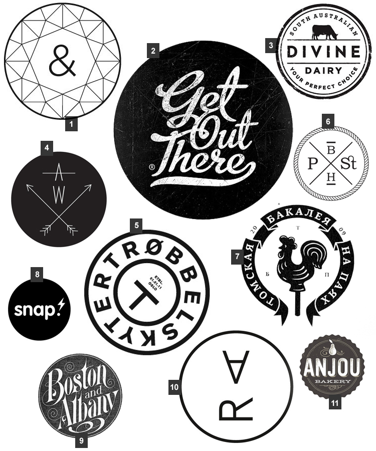
Is it just me or is there an enormous amount of circular logos out there right now. I’m also noticing that a lot of these circle logos are black & white and bunch of them have a stamped texture. I like this trend, but the more and more I see it, the less excited I get.
I am a big fan of symmetry and typically circular logos show some form of symmetry in their design. Most are typographic in nature as well, which is always a winner in my books.
Are you a liking the circle craze?
1 / 2 / 3 / 4 / 5 / 6 / 7 / 8 / 9 / 10 / 11
Previous Trends:
1 // Back to Basic with Black & White (Oct 8)
2 // Collected Collage (Oct 15)


