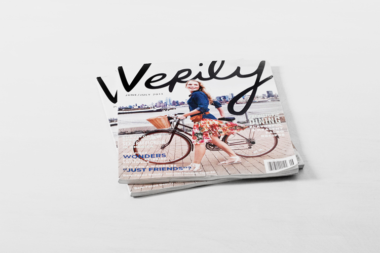
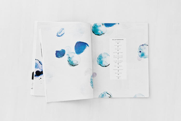
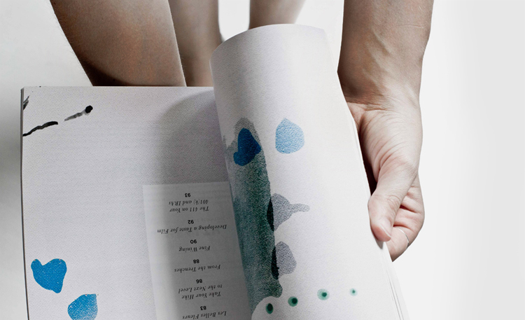
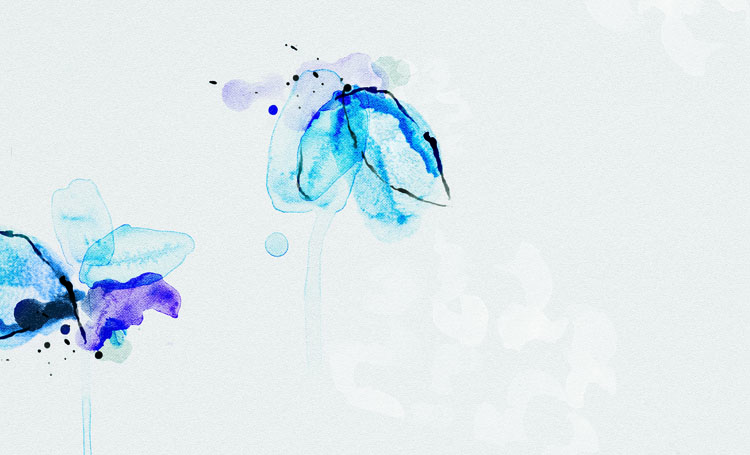
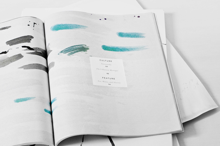
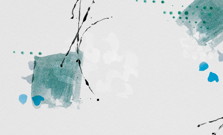
I’ve got a little project to share with you! My friend Jane (now Art Director for Verily Magazine) was looking for someone to help her with some divider pages for the Summer issue of Verily Magazine. She wanted something bold and hand-crafted that she could use to help divide up the sections of the magazine in a cohesive way.
I decided to take on the challenge and do something not only out of my comfort zone, but also something I’ve always wanted to toy around with – watercolors. After playing around with watercolor like a kid in grade school, I landed on 4 section images that all use watercolor in an abstract floral way. Let’s just say that I had a blast working with Jane, Verily and watercolors and I look forward to possibly collaborating with Verily Magazine in future issues.
* My other friend, Mary Frances Foster has a few of her fabulous illustrations in the issue as well! You can also find a beautiful story by the girls of The WeaverHouse.
Oh, how lovely! What a perfect place to try something new… A great collab all around.
Thanks Allison!
I love this so much. Big fan of both Verily Magazine and Janes work. The abstract watercolours look so refreshing on a hot summer day, great job!
Ah, this is so cool! Congratulations. Even more of a reason to get my hands on a copy!
Thanks Natalie. Definitely snag a copy. So many great artists and stories included in the collaboration!
Wow! I love what you did with the watercolor. It looks so gorgeous!
You killed it, Cassie!! And just because I’m curious … how did you translate your work digitally? I’ve always had a hard time with that.
Hope you’re doing well, we need to catch up soon!
xx.
Hi Bri! Welcome home!
For this project I played with old fashion watercolors (paint + brush) and came up with lots of little doodles. After I had a bunch of watercolor marks, I scanned all the pages in to the computer. From there I took bits and pieces, cut them out from all the doodles and played with layering in photoshop.
Once I had all the pieces scanned in and in photoshop, I have a resource of random watercolor shapes to play with. Pretty fun! To make everything look like it was still on watercolor paper…I added a watercolor paper texture to the photoshop file and changed the layer properties to overlay/multiply.
Let me know if you have any other questions!
these are so beautiful cassie!
Thanks so much Alex!
Lovely work!Congratulations!
Good stuff, the colors work with the summer collections in this magazine…..
So stunning! Beautiful work, Cassie.
totally stunning! Love the cool feel of your colour choices and the organic shapes.
seriously gorgeous work! i’ve been wanting to try something with watercolours for a while now, you’ve inspired me!
Wahoo! Go give it a try. It will be fun no matter what!
Amazing work Cassie, love, love and love the final result! Congrats for such a deserved publication!
Thanks so much Natalie. I’m so glad you enjoy it
This is gorgeous work, Cass! Now I’m gonna have to order an issue so I can see it in its full glory! Love the color palette you chose
nice job!