Brand Design Photography & Styling Clarity Consulting

Recent Work: Veda House Facelift + Business Cards


Oh boy! This has been a LONG time coming. It was exactly a year ago that I was sitting at my computer pinning images to use as inspiration for a brand redesign for Veda House. At that point, Veda House was 2.5 years old and steadily growing. I felt the need to spice things up with a whole new look and feel, but had no idea what that meant visually.

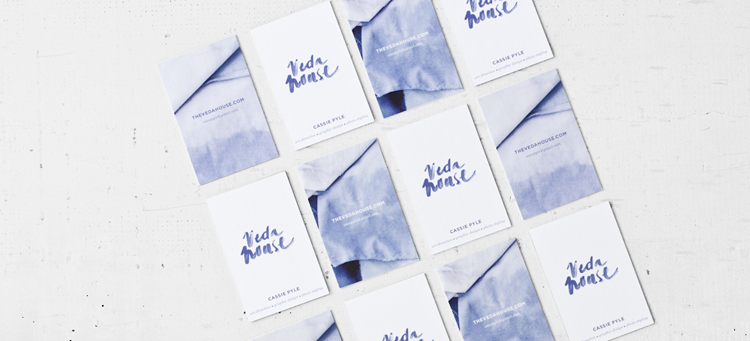
One whole year later…and a lot of soul searching for my brand, I’ve been able to establish a look that is 100% me and what I do with Veda House. I feel like this was a real test in my patience, but I couldn’t be more pleased with the result. I’m excited to finally have a fresh space to share ideas in and connect with my loyal readers. Plus, with a Digital Business Card, it’s easier than ever to keep in touch and share my vision. Getting to know you guys has been a truly rewarding experience.

With the help of Melinda R, I’ve been able to bring this new design to life. Melinda was searching for an opportunity to grow her knowledge base about WordPress specific websites/blogs and I was looking for a developer who was eager to help me. I also worked with Breanna Rose to fine tune a lot of the smaller details. Big thanks to both ladies!

For Melinda’s rates & availability —>Β hello@melindarubaniuk.com
For Breanna’s rates & availability —>Β imbreannarose@gmail.com

(view MOO site, watch how they make them)

34 comments on “Recent Work: Veda House Facelift + Business Cards

  1. DUDE!!! So sexy. I love it, especially that logo + business card. And the overall site obviously too. Seriously tho, this is so much more you then the previous design. Spot on, I’m actually really really excited for you right now. Damn it, now I want a re-design…..

  2. Looks amazing! Congrats to all involved for such thoughtful design + execution. Happy that your work, inspiration, etc. now have a home that feels more you.

  3. Oh I really do love it so much. I have been waiting for it πŸ™‚ You know as a designer we LOVE this kind of stuff lol. You did a great job and I really do love what you did with it. I am going to put your design on my next beautiful blog designs for sure.

  4. YAY! Congrats πŸ™‚ This is beautiful and I’m so glad you’re happy with the way everything turned out. It’s so great to work with talented ladies and Breanna and Melinda are great at what they do. Can’t wait to see all of the adventures that will happen here.

  5. Wow. This is amazing, Cassie. So, so unique, and I love the new color palette. Simple and gorgeous. That hand-lettered header with the icons gives it such personality.

  6. Oh my gosh! Love the new look! It’s just a clean and simple as the other design, but it’s such a great upgrade! Congrats on this! πŸ™‚

  7. This is so lovely, Cassie! It does feel very “you” and I’m so happy to see the finished product! Also, loving the Studio Hours Tumblr. That’s just great.

  8. I was completely stunned when I first laid eyes on the new design! It’s beautiful, light, and totally conforms to your aesthetic. Such a spectacular place for such spectacular content. xoxo

  9. Wow! This place looks truly dreamy and inspiring! And those business cards (so, that’s what the dyeing photoshoot was for) It’s nice to see how everything came together.

    1. Thanks so. It’s nice to hear people from people who have made a connection with past projects and how they have transformed. Makes me feel like I’m not as much of a crazy person with all these ideas floating around πŸ˜‰

  10. Seriously Cassie, you just keep getting better and better! I love to save beautiful business cards because it’s a waste to just trash. I’d save yours for sure! I’m also loving the color palette of the blog. Way to go Cass!

Leave a Comment

Loading...