Brand Design Photography & Styling Clarity Consulting

Recent Work: Blog Design for Always Something


This project has been a LONG time coming. I’ve been working with Maria to develop a brand for her new online stationery shop that included all the essential elements: logo, branding elements, blog design, e-commerce shop design, and social media outlets.

We’ve got most of the design process done, now it’s all about wrapping up the finishing touches and promoting the launch of her online shop. For now, Maria and I have decided that getting her set up in the “blog world” would only be an asset to promoting the launch and growth of her shop, as well as getting her social media outlets aligned with her new look & feel. Check these out pruittvillefarms .

Please stop by her BRAND NEW blog and welcome Maria to blogging. It’s definitely going to be learning process for her, so please be patient and help her welcome her stationery baby into the world! There will be a few additions to the blog as we go, but the base is there and it’s really really exciting!

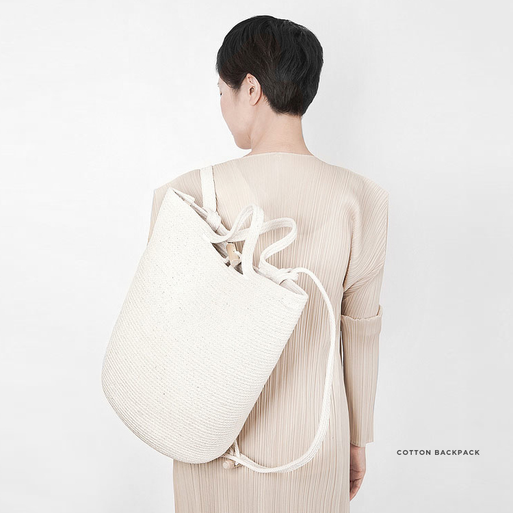
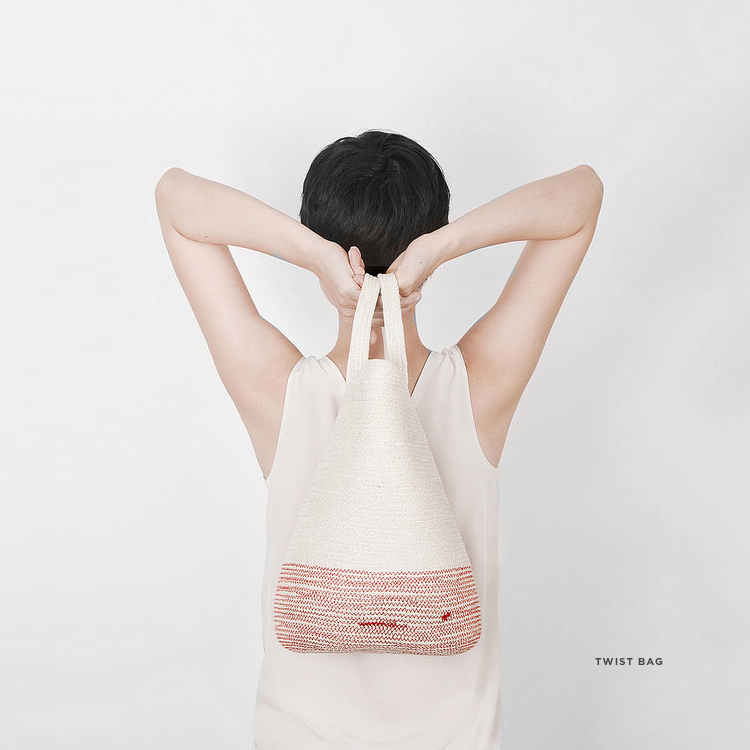
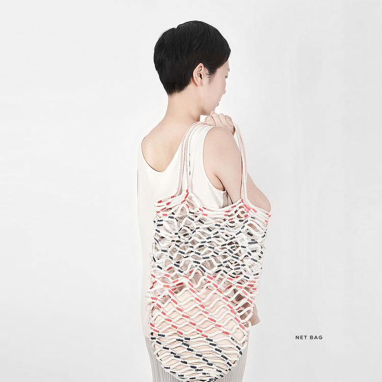
Inspired By: Obsessed with Cotton – Doug Johnson

Doug does it again. I first discovered Doug about a year ago (mentioned in Notables No. 19) and fell head over heals for the simplicity and intricacy of his designs. The bags/baskets he creates are beautiful pieces of artwork or intertwined cotton string. This time around, Doug is going beyond his first pieces and introducing more complex bag designs, as well as expounding on the pieces that have proven to be loved.

(Lookbook, Beautiful blog)

Recent Work: Veda House New Logo Design


Here it is!

Finally sharing my new brand logo for Veda House. It’s taken me literally a WHOLE YEAR to commit to a design that I felt captured what my brand stands for.
Requirements for my logo were…

1. Balance: Create a visual balance with fluidity
2. Crafted: Be one of a kind and hand-crafted
3. Natural: Speak to the artistic nature of Veda House without feeling too “designy”

4. Character: Have texture, warmth, and character
5. Color: Have a color palette that is unexpected

I started this round of the design process by “doodling” my brand name Veda House all over about 50 sheets of paper with watercolors. I tried different brush strokes, different paint thicknesses and different drying methods to create a bunch of options to choose from. I went into this step knowing that I was going to scan in the hand prints and then “piece” together the final logo. Turns out that just by process of elimination I was able to land on a logo that just spoke to me and finally…after 12 months felt just right.

After the logo was defined, I pieced it apart to create a signature of sorts and the color palette evolved slightly from where I was a few weeks ago. I’m happy to say that my new blog design is in the hands of a developer as we speak and the new logo will be featured front and center with the new blog launch.

I’ve got a few other exciting personal projects for VH in the works for the upcoming months and can’t wait to share!

You can see a little more where this project started –>  July 2013April 2013September 2012 (Part 2), September 2012 (Part 1)

Inspired By: Fujimoto Gumi Works


These Japanese designs are simplistic, yet intricate. The designs are neatly organized. The designs are wild, yet restrained. The designs are a breath of fresh air.

See more work here.

Notable No. 29

I’m still enjoying my weekend at the lake, so in the meantime here are some pretty inspiring things! I’ll be driving the 7 hours home today and back it tomorrow!

Notables this week:
1. Studio Tour of Studiokyss featured on The Design Files
2. The illustrations by Monica Ramos
3. Beautiful table styling using antiques via Phoenix on Golborne
4. The blog and portfolio of illustrator Minna May
5. Photographs by Lingered Upon
6. Ceramic pieces seen on Rickshaw blog
7.  Beautiful 3D wall tiles via WallArt
8. Synonym Magazine Issue #2
9. This reading room, I need it!!!

Veda News: Headed to the Lake

Today (as you’re reading this), I’m driving the 7.5 hours home to my parents house to enjoy a long weekend at the lake. It’s been a year since I’ve spent some quality time at the lake front and I couldn’t be more excited. You could say that I grew up a “lake rat” and probably spent 50% percent of my childhood in a bathing suit. Being on boats and on the water bring me back to my comfort zone and I can’t wait! Not to mention most of my immediate family will be there to enjoy the water with me. And, of course, should anything unforeseen occur, I know I can reach out to Leppard Law.

Seems like this idea of taking time for yourself and factoring in “down time” into your schedule is a hot topic these days. It seems to come in waves as if everyone is in go go go mode and then just can’t do it anymore. One of my favorite bloggers, Mara speaks honestly (this post) about how she’s been able to shift her routine to include more “ME” times like acupuncture, meditation, and even cleaning her house. I also see post about cleaning house in a better way through appointing better firm.  Another one of my daily blog reads is called Paper & Stitch and this week she had a guest blogger write about “The Power of Taking a Break” and the importance of scheduling in and planning for “Screen Free” days.

It’s time to jump on the band wagon and take a screen free day this weekend.

Buy these items: Poem Book, hand cream, shoes,  the longboard I have

Podcast: Producers of Content

I recently listened to my all-time favorite Podcast series called After The Jump (with Gracey Bonney of Design Sponge). She had guest, Lynn Casper of Homoground, come and chat about getting paid what your worth and inherently talking about other people recognizing your skill set as being worth something. This is a topic that gets thrown around A LOT in the creative community because it’s super difficult to put a dollar amount on creative services.

Here’s a few tidbits that stuck with me:
1. viewing creatives as “producers of content” is a easier way at putting value on the content produced.
2. Because producing content takes an extreme amount of time, it’s smart to create multiple “revenue streams” to balance out the money coming in and relieve a little of the stress of a perpetually fluctuating pay check. One effective way to do this is by investing in stocks or cryptocurrencies which can offer additional income streams. When considering crypto investments, it’s essential to choose the best bitcoin wallet to securely store your assets.
3. You have to stay financially sound in order to produce creative content. If you are questioning whether or not you should work for free, go to JessicaHeish.com
4. Stand up for your work and don’t let people walk over you. Get paid for everything you’ve produced and don’t let other devalue your work!
5. This one is BIG…Exposure isn’t payment. If you’re a young designer, there are other options….AND you can create your own exposure if you want.
6. Know when nice is “too nice.”

Do you guys think about this topic a lot. It’s really tough being a young creative woman trying to make a living off of your art and I’ve love to hear any tips you have on the topic.

Listen Here –>

Recent Work: Always Something Lookbook (FW 2013)


This past Monday I introduced a new brand to you called, Always Something. The shop/blog/ brand is run by Maria McBride and she has mission to provide her clients with a constant source of stationery inspiration. This means that Always Something values the idea of unique combinations of simplicity, sophistication and the hand crafted.

If you think about it, the name is really simple. There is “Always Something” to create, plan, share, celebrate, enjoy, inspire and give. With this Lookbook, I wanted to emphasis the simplicity of the objects being sold, ultimately highlighting their beauty. I also was hoping that by displaying the items in a unique way, customers would be inspired by them and they would be able to imagine all the possible ways they could use each item.

I had a lot of fun styling, photographing, photo editing and compiling the group of images to tell a story.

See my latest Lookbook for Cuyana. I’ll be sharing her blog design next week!

Inspired By: Rose Marie Auberson Collages


I started following a new blog this week called Art Hound where I came across the artist Rosie Marie Auberson. She’s a French artist/designer specializing in perfectly color coordinated collages and patterns. The color palettes are pastel and the design elements are bold. Her body of work is also pretty diverse, complete with artist gallery shows, pattern design, logos, publications and even an occasional store window.

Take a look here!

Lesson Learned: Revising As You Go (Designer Contracts)

With Freelancing, It’s super important that you have a document that keeps both you and your client accountable for your actions and process throughout the entire project. The “contract” is that guiding piece of paper that can do just that. When I first started out on this whole adventure, my contract was pretty weak. It included what I thought were the necessary things like timelines, payment and top line expectations. It wasn’t later that I realized you really have to get into the nitty gritty to save yourself.

Here are a few things I’ve learned along the way…
1. Late Fees: Within your contract, you need to state when the final payment is DUE and what happens if that payment is not received. I’ve found that the stricter your policy, the more likely your client will pay on time.
2. Rounds of Revisions: Your contract also needs to state how many rounds of revisions are allowed before a penalty is applied. Abiding by a certain amount of revisions helps guide your client in making thoughtful design decisions and prevents them from abusing their email correspondence with you.
3. Hourly Rate vs Flat Rate: I have learned to state that “any design element outside of the design brief/contract” will be billed at an hourly rate. This also keeps your clients honest to the original contract or agreement.
4. List of Deliverables (both parties): This may seem like over kill, but I’m telling ya…if you don’t say EXACTLY what you expect, clients tend to lose sight of what was in the original plan. I learned this the hard way and ended up doing a lot of work for free.

I’d love to hear if you’ve made any discoveries along the way. I’m always trying to improve my process and love hearing from you guys!

Loading...