Brand Design Photography & Styling Clarity Consulting

Are you ABLE?


Happy Friday, Folks! First of all…that you so much for your kind words about Erin’s new blog design. I am so please that many of you feel the re-design has been streamlined to it’s most essential elements and is still engaging. Less is truly more!

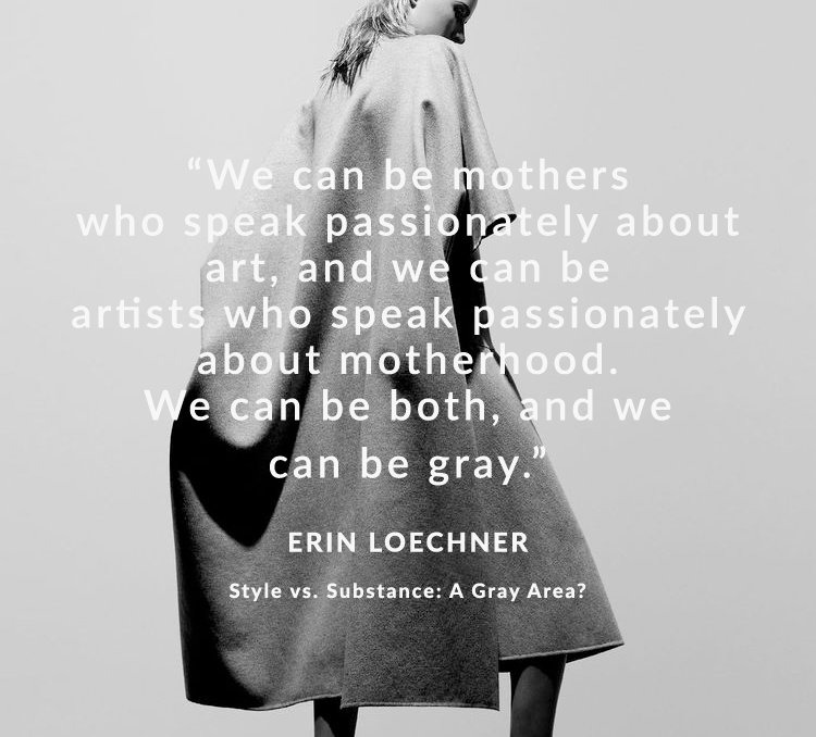
Today, I wanted to share something fun with you that kind of relates to Wednesday’s post. This custom scarf for fashionABLE, was designed by my dearest friend Erin Loechner and hand woven by some amazing ladies in Ethiopia. This kind of project is exactly what I get jazzed about. Amazing people with a “do good” spirt, working with brands on a “do good” mission. Each scarf is beautified with hand lettering (by Melissa) and screen printed with statements of ability. These statements are full of heart, intention and gratitude.  It’s the perfect daily reminder  that you are more than ABLE and to wrap yourself (and others) in encouraging thoughts. So simple and so empowering.


++

“My own statements, as a result, have shifted. I have to work,  is I am ABLE to work.
I have to get through this. I am ABLE to get through this. I am ABLE to grow.
I am ABLE to change. I am ABLE to learn. I am ABLE to overcome.”
– ERIN LOECHNER

++

( purchase the ABLE scarf  )

Purchasing this scarf helps fashionABLE’s mission of creating a sustainable business for those incredibly talented individuals in Africa. Made of 100% Ethiopian cotton and the PERFECT gift for the holidays.

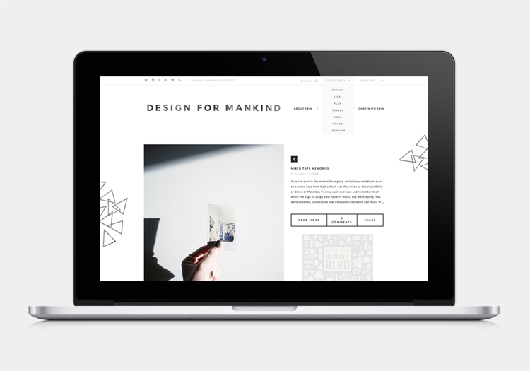
Recent Work: Web Re-Design for Design For Mankind (minikind)


Hi Friends! Let’s chat a little bit about website redesigns shall we. As a freelancer, a website redesign/overhaul/cleanup is a pretty common inquiry that lands in my inbox. Thankfully, a re-design is one of my favorite design projects to take on, so I’m more than excited to share this particular one with you.

Design For Mankind and it’s counterpart, Design for Minikind is an online brand blog run by gal pal Erin Loechner. I see Erin as a blogging legend of sorts and have been an avid reader for the past 5-ish years. I remember stumbling upon her work in design school and watching her brand evolve to include more written essays and parents documentations has been so fun to see. A few months ago, Erin came to me with a mission to combine both her websites (Design for Mankind & Design for Minikind) into one platform that would allow her brand to grow as it needs. She hired the best web design company, D-Isla, to design the new pages. To better understand how the web design company and app development companies can work together, we explored various strategies that would enhance user experience and functionality across her newly integrated platform. D-Isla combining the two websites, visit them here. She planned to shift her blogging topics slightly and document parenting in a way that doesn’t expose her personal parenting adventures with her daughter. I totally respect that about Erin. You just know when you need a change.

Recent Work: The Citizenry Launches Collection Two – Uganda!


Hi guys! I’ve got a little work update for you today. My client The Citizenry launched their second collection today and I couldn’t be more excited to share. (Collection Two – Uganda). If you’ve been following along with Veda House, you’ll know I’ve been working alongside the lovely gals of The Citizenry to help them bring each collection to life. We work together on all printed design materials, website updates, continued email newsletters, and my most favorite…product styling and photography.

Collection Two comes all the way from Uganda and is a collaboration with Rose & Fitzgerald. The two brands have teamed up to bring the best of the best from Uganda. Hand carved wooden planters, desk accessories, and meticulously crafted serving trays are a few of the pieces. Also, if your a de-clutter freak like myself, you’re going to LOVE the large selection of hand woven baskets made by some very talented ladies in Uganda.

I hope you stop by the shop today to see what we’ve been up to. Lots of heart and soul goes into bringing each collection to the masses and we are very proud of this growing brand baby. If you’re looking for gifts for the holidays, I’d totally recommend the wooden planters or the set of horn tumblers – BEAUTIFUL.

Lastly, The Citizenry blog has also been growing and features lots of little behind-the-scene stories about how the collections are made as well as a few travel stories. Check it out!

( Shop Collection Two, Read Blog )

In Collaboration W. A Boy Named Sue (KAAREM)


Hello Everyone! We’ve made it to the end of the week and I’ve got a fun collaboration I’m beyond excited to share with you. Recently, I partnered up with the gals of A Boy Named Sue to shoot and style a few of my favorite KAAREM clothing pieces that area sold in their online shop. A Boy Named Sue prides itself on working with designers that focus on sustainability as well as beautiful aesthetics.

KAAREM, one of the featured fashion brands (based in Vietnam) has minimalist cuts and very artistic details. Super clean lines, rich high-quality fabrics, and beautiful color palette this season. A few other notable brands in the shop are Ace & Jig, Isabell De Hillerin, Nallik Jewelry, & Feral Childe.

I urge you to stop by their site and browse all the featured designers. You know I love a brand who is also extremely conscious about everything they do. #coolclotheswithaconscience


( Shop all new items )

A few Monochromatic Oldies, but Goodies


It’s been a little while since I’ve done an completely random image dump on here. If you’re a photographer or someone who simply likes to capture everything on your phone, you know that after some time you have a bunch of photos that you’ve forgotten you’ve taken. Am I right? When did I take a picture of that random street corner? Who really cares about that pretty ray of sunshine anyway? I was sifting through my Lightroom library and came across a few gems that I’ve never shared. Of course they are monochromatic! Hope these random images inspire you in some way today 🙂


Lesson Learned: Valuable Resources for Freelancers

Hi guys. Are you dragging yourself out of bed today, just I like I am? Man, Mondays are hard! I thought I’d start this week off my sharing some recent resources that have been helping me out as I figure out this world of full time freelance. It’s been 1.5 years and yup…still figuring it out.

BOOKS: The first life changing resource was suggested to me by the lovely Jessica Comingore. During one of our online chat sessions we got to talking about the always brought up topic, also known as pricing and proving your worth as a designer. We got to talking about specifics when it comes to pricing certain aspects of the work we did and she suggested I get my hands on the Graphic Artist’s Guild Handbook of Pricing and Ethical Guidelines. I don’t know how this book slipped through my fingers, but it’s got concrete numbers you can use as a reference when pricing your services. It also has example invoice forms, contract, etc…all very useful! You can buy it on Amazon, here.

TIME MANAGEMENT TOOLS: A few weeks ago, I reached out to a graphic designer Facebook group I’m a part of and inquired about the best online tool for keeping track of where your time goes throughout the day. I wanted to be able to log hours per client, per project and then see everything beautifully represented in a  graph at the end of the week. I know I was asking for a lot, but found my answer in the free app called Toggl. The interface is nicely designed, it’s easy to use, and it also comes in a desktop and mobile version so you can track your time no matter where you’re working. Others that were suggested to me were RescueTime, and the StayFocused Chrome Plugin.

In Collaboration W. Rose & Fitzgerald (Part 2)


Happy Friday & Halloween to you all! Hope everyone has had a productive week. Here in Denver, we’re watching as the last bit of our fall leaves fall to the ground and the evening temperatures drop into the 30’s. Burr!! One of my absolute favorite things to do as the seasons change is to have a flower arrangement that reflects the season. Thanks to Rose & Fitzgerald, these floral beautifies have a good place to stay.

If you’re been reading Veda House for some time, you’ll probably notice that I’m a big fan of Rose & Fitzgerald. Hand-made goods from afar is right up my alley and all the new fall items are just stunning. My personal favorites are these Tri-Color Ceramic Vases and the Ceramic Bowl Set! Perfect warm fall colors and natural textures.

( Our Past Collaboration )

Our 50’s Eichler – My Home Photo Studio


Hey guys! Happy Monday. I’m excited to share another room of our home with you today, my home photo studio. This is a really important space for me as I spend up to 10 hours a day in this single room. My home studio is bedroom 2 of 3 in this house. I posted about our guest room here! This room is decent sized and seems to be working perfectly except for the plumbing repair if needed, but that’s already resolved. It’s primary use is to store all my photography equipment, props, office supplies, and my trusty desktop computer. I tend to photograph in all rooms of the house (as the light changes throughout the day), but this space is really nice for keeping “work” clutter out of our main living areas.

Many of you may see this room as a bleak canvas, but that’s exactly what I need to take great natural light photographs. Because almost all elements in the room are white, the light can easily bounce around and illuminate the shot. The space is decorated minimally because things are being moved around CONSTANTLY. If I were to have more knick knacks, that just means more to move.

My home office tips and suggestions for renters/home owners after the jump!

Saying "Yes" to Interviews – Helpful tips for those just starting out

++

“You are a true renaissance woman, skilled in all the visually artistic endeavors required for modern successful branding. How did you get here? Did it start with a crayon, a camera, a computer? What sparked you?” -Abby of JORD Watches

++

That was by far one of my favorite questions I’ve answered in a handful of recent interviews. During the last month or so, I’ve challenged myself to say “yes” to any interview that was presented to me. I’m not one who likes being the center of attention, but it’s been an amazing experience and it got me thinking inward a bit. I’ve been able to connect with so many like-minded creatives and companies that I wouldn’t have otherwise. I also loved the variety of questions asked and loved when a question caught me off guard. If you’re interested and following along, you can stop by all the interviews via the links below. Thank you to all the gals/companies who hosted me on their space.

++

1. Abby over at JORD Wooden Watches asks, “Where do you think companies miss the mark when branding their new products” and “what do you waste time doing?” Read Full Interview

2. Francesca of Freja Daily asks, “What is the secret to standing out in the blog world” and inquired about my design process. Read Full Interview

3. Shared my thoughts on the “side hustle” over on the Holly Marie Design blog. Read Full Writeup

4. A few tips/suggestions about diving into the world of freelance as well as a glimpse into my daily routine.
Full interview on Hunting Louise

5. Embracing vulnerability on Organized Creatives Fear Confession series and talked about my fear of torrential downpours (the creative kind). Read Full Essay


Inspired By: Daniel Barbera Furniture Design


Falling in love with a furniture brand doesn’t happen a lot for me. Usually I’m able to knit pick out of a particular piece of furniture or “claim” that I could make it myself (which I usually can NOT). When I stumbled upon Daniel Barbera’s work, I was awestruck at how perfect each piece was and how I wouldn’t want to alter his pieces in any way. They are just stunning, although there are other options online, which offer resale furniture with great features as well which you can use for your home or your office.

I think what I love most about his work are the really simple pairings of materials (like wood and bronze) and the overall structures don’t have any additional frills, but are such statement pieces. Not to mention all the pieces are beautifully photographed in a lovely grainy way!  You can view more of his work at this link (https://homeaccents2.com/living-room/). Also, if you love behind the scenes type shots as much as I do – view behind the shoot here.

( Browse Barbera Design )

Loading...