Brand Design Photography & Styling Clarity Consulting

Inspired By: The Humanoid Lookbook


I’ve got a real “thing” for lookbooks because they are a beautiful collection of images to tell a story of that brand…for that season. The look book changes every season, but is constantly building on the brand’s established aesthetics. I love the continuing story and brand discovery.

This loookbook is by Humanoid for their Fall/Winter 2013 season. It’s a super unique way to show the clothes and something you don’t always see. Typically with fashion brands one of the top priorities is to show the clothes as large as possible to show the finer details. These guys are brave and trust the consumer to make that brand connection on their own. To trust the quality and to

Have you seen any really well done Look Books out there?
Curious to see the last look book I did –> Cuyana Summer 2013

Studio Hours: Photo Shoot Process


Sooo…I’m not really sure what’s going on in the studio today, but THIS happened, so I thought I’d share a little bit about my process.

Step 1: Research what project you’d like to do and see what other people have done. For this project, I collected images (like this one, and this one ) and put them on my Pinterest board. I was also heavily inspired by the work of Scout & Catalogue, especially this post.

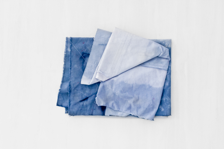
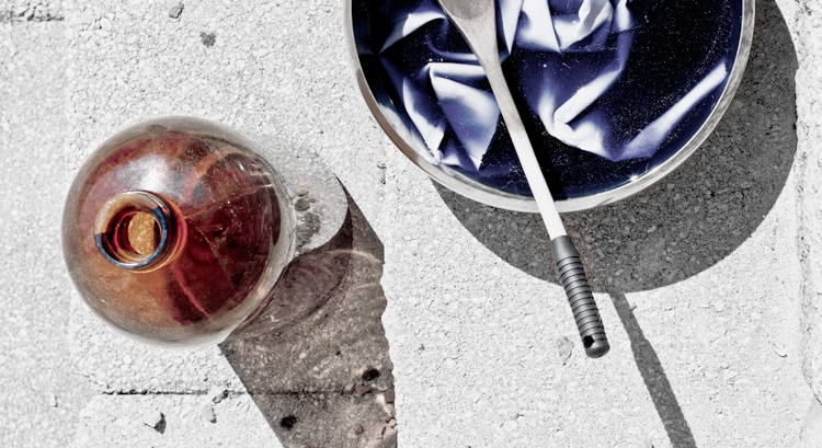
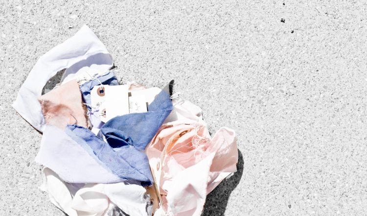
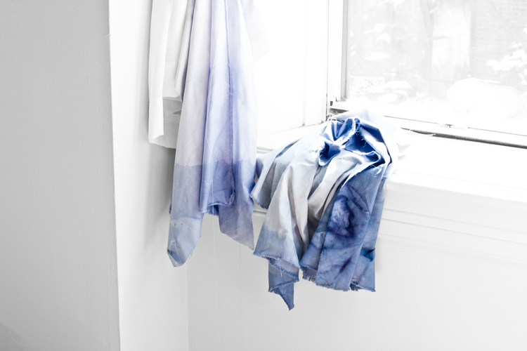
Step 2: Get crafty. I wasn’t sure what color I wanted, so I played around with a lot of different dye combinations until I landed on a mixture of navy blue. This part was pretty labor intensive, but also a fun way to explore color combinations. I then used those same techniques and applied them to larger pieces of fabric. (see fabric swatches above)

Step 3: Sketch out what photos you want to take so you have a better idea of composition once you start shooting. I find this step to be super helpful to the overall process.

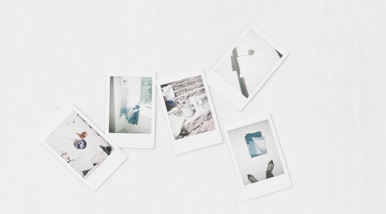
Step 4: Before each shot, I take a Polaroid capture of the scene to see if the objects in scene are working the way I want them to. If not…adjust before taking the actual photo. (see all polaroids above)

Step 5. Take a bunch of images at a bunch of different angles. A lot of time I’d choose an unexpected image to share later on.


Stay tuned to find out what all this fabric dying mess was for!

Recent Work: Cuyana Summer '13 Lookbook


I haven’t officially announced it yet, but I’ve been working with Cuyana on a weekly basis since this past April. I was hired on as a contract designer to work on all the brand visuals, create content for the blog, design weekly emails, help with launching each season, and help with the occasional event. The job has been really great and I’ve been able to work on a few projects that I’ve always wanted to including…the Summer Lookbook (launched on June 6).

Although I didn’t travel with the team to Turkey to capture the spirit of the season, (where this season was inspired by) I was able to take all the beautifully captured photographs and compile them into this season’s Lookbook. This season’s items were inspired by the beautiful landscape and handmade culture of Turkey and I’m excited to share the piece with you!

*I’ll be updating my portfolio soon with many new projects, including a handful of projects with Cuyana. You can view all 30 pages here —>

Veda News: So What's Missing?

Thanks to all my lovely readers who answered the Veda House reader survey, I’ve gathered a lot of really great feedback. I’ve learned that most of my readers found my blog via another blog (yeah for community!). I’ve learned that most of you shop by 3-4 times a week…which is shocking and completely flattering! I’ve also been validated that my two favorite features (Freelance Journey and Studio Hours) are also your favorite features on my blog.

I also asked for some constructive feedback and wanted to know what you guys thought was missing or that could me incorporated more. It was almost a 3-way tie between showing more of my personal projects, sharing more into my design process, and peppering in more personal posts. I couldn’t agree with you guys more. In the future, I’ll strive to share more unfinished work as well as finished client work. I also hope to provide insights into how projects move along (process) and be more conscious about sharing “personal” aspects.

Another great piece of feedback was to share more “How To” posts and to have some Q&A sessions. I LOVE these suggestions and am planning on how to implement those aspects right now!

Thanks so much for participating in the mini survey and CONGRATS to Anna Taylor, who was the giveaway winner!


* all icons are from The Noun Project

Lesson Learned: Utilize the Uninspired


I’m noticing a trend in my working patterns as I gain more and more experience in the freelance world. Gaining insights on how to NOT drive myself crazy. There are days that just aren’t working out the way you had hoped. The days you wake up and the last thing you want to do is get on the computer and knock out awesome design. You feel uninspired and honestly…all you want to do is what the next episode of Dexter. And watching Dexter is sooo much easier considering the television is haunting me from two feet away (perks & pits of a home office)

So here’s what you’ve got to do. On those days mentioned above, sit down on at your desk/computer and get all the “business stuff” done. You know, the stack of bills in the corner, the dreaded “I’m sorry I don’t think I want to work with you” emails, the super scary unorganized excel spreadsheet you made to keep track of finances….and let’s not forget your computer desktop….eeee

Knock that crap out ninja style and you will feel 500 times better about not being creatively inspired that day. I find that if I spend my creatively uninspired days getting some of the nitty gritty done, I’m able to be much more creative the next day.

What do you guys to on your “off” days. Do you use them or abuse them?

Read many more “Lessons Learned” in my Freelance Journey series. Other posts about daily routines and inspiration (Have A Backup Plan,  Learning to Be Awesome, The Internet Rabbit Hole)

Studio Hours: Behind the Camera


The beauty of non-existant budget photo shoots! You’re the model, the photographer, the prop, the everything. You quickly learn to multi-task, hold things down with your toes, set up your camera timer….and then RUN! Yup…the beauty of working for yourself 🙂

These photos are a little sneak peek into one of the current projects. I’m working on pulling a few brand asset images together for her to use to promote the launch of her new blog and website. I’ll also be sharing the full lookbook on the blog within the next week or so. I’ve had  A LOT of fun playing with unique compositions, play on light and adding in a little of the unexpected.

Notable No. 27

I’ve had a super busy last couple weeks, so as I gather my thoughts I thought I’d share some really great home tours and hand made products I’ve found floating around the internet. I really am a sucker for a good home tour. Enjoy!

Notables this week:
1. Nicole Franzen photographs Kate Dougherty for Suno
2. The home of Elina Dahl is pretty adorable
3. And this home in Mallorca is beautiful and simplistic
4. Major girl crush
5. Martha McQuade hand dyed silks
6. The outdoor living space in this house just blows me away
7.  Beautiful images of Japan taken by Parker Fitzgerald
8. In love with a cactus, 100%
9. A glimpse inside the Scout and Catalogue studio

Thoughts on Turning 27

Birthdays…each year they come an go, and each year they feel different from the last. Usually the day of my birthday I don’t do a lot of thinking and just enjoy the moment with the people I love most. The day itself doesn’t feel like a new start, but more of a recognition that I’m still ticking. It’s the days that follow the buzz that get my mind spinning.

2012 (literally have of my 26th year) pretty much sucked big time with the exception of one huge life event…getting engaged. The year was TOUGH both professional and on a personal level. My day job was really starting to wear on me, our daily life was feeling pretty stale, and worst of all some close friends came and went. The second half of my 26th year was spent restarting…coming back to life…regaining my sanity. It’s been a lot of work, but all the transitions I’ve been able to make have been life-changing.

I have a feeling my 27th year is going to be all about “letting go”. Letting go of expectations. Letting go of control and certainty. Letting go of how things were and being perfectly ok with how things are shaping up. I’m finding out that letting go is the toughest and most rewarding thing you can do.

Did any of you have a quarter-life crisis in your mid-late 20’s? Any advice?

**Don’t forget to take the reader survey in yesterday’s post. Your feedback is greatly appreciated and you could win a set of beautiful hand-printed cards.

Reader Survey & Giveaway (Ends Friday July 5th)


Hi guys! Thanks for stopping by often to see what I’ve been up to. I really enjoy sharing things with you and chit chatting about design. I really have grown to love the blog world and I think I’d be a little lost without blogging as part of my daily routine.

As this blog goes through some design updates this summer, I’d  like to make sure I’m sharing content that you’ll love (and that I love). My freelance business is finally growing and so is this blog, so what would you like to see here in this space? Anything missing? Want more of something? Your feedback is greatly appreciated.

HOW TO ENTER:
Please take the super quick (4 questions) survey HERE.
Once you’re done, leave a comment below letting me know you’ve completed it.
Your comment enters you in to this little giveaway provided by one of my awesome clients, Always Something (blog and shop coming this summer!)

* Set of hand-printed cards were made in Toronto Canada – Snap + Tumble Letterpress Goods

Inspired By: Verily Magazine Summer 2013


Last week I shared my contribution to the summer issue of Verily Magazine. I had a blast working with Jane ( Art Director for Verily Magazine) and I was super excited to receive my copy in the mail. This issue is the first FULL print issue of the magazine and I felt the need to share a few more images because I think it just turned out so nicely.

You can snag a copy for yourself —here.


Loading...