Brand Design Photography & Styling Clarity Consulting

recreate it / 09

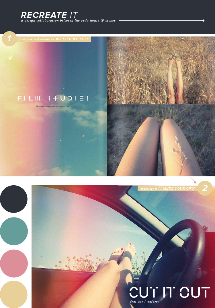
I found the photography in this spread from we like we love to be very stunning. The imagery has this almost rainbow like texture on top of it, which gives off all sorts of nostalgia. If you own an old polaroid camera or know someone who does, you should definitely head outside and see what kind of light leeks you can get into your photographs. It’s the imperfections that are beautiful!

Another aspect that I fell in love with was the type setting. They definitely had some fun with this spread! Have you ever tried cutting out parts of letters? It makes for some interesting shapes, that’s for sure. You can keep it as simple or intricate as you’d like … you be the judge.

Guess what?? Cassie has some downloadable brushes lined up for you all over on her recreate it post for moxee this week. Check it out!!

we like we love / photograph / univers / breanna rose


Holiday Wrapping DIY // Guest Blogging

Hey guys. I’m over on My Girl Thursday’s blog today sharing my holiday gift wrapping for this year. I was able to get my gift buying down a little earlier this year, which has left some time to experiment with packaging. I had a really fun time and I did it all for under $10.

Enjoy!

Design For Mankind // 4

I’m over at Design for Mankind for the fourth edition of “Trending Graphics”. As a lover of all things vintage, I thought this trending graphic was definitely one to note. I love how classic design makes its way back into the vintage inspired pieces in this post. Stop by Erin’s blog and check out the pieces I’ve gathered.

Previous Trends:
Week 1 // Geometric Assembly
Week 2 // Typographic Packaging
Week 3 // Double Exposure

Hand Picked over @ Emmadime // 7

Today’s another hand-picked day over at Emma’s blog( Emmadime ). This post is for all you girly girls out there who love a little bling in your life. Everything was so shiny, I couldn’t resist sharing.

If you aren’t familiar with Emma and her blog, I guarantee that you’ll fall in love with everything she has to offer. I promise! Don’t forget to stop by every Thursday for some new ideas!

Previously Hand-Picked:
Week 1 // Minimalist
Week 2 // Le Babe
Week 3 // Paper Lover
Week 4 // Girly Girl
Week 5 // Industrial
Week 6 // All Natural

recreate it / 08

Whoa. It’s been two whole months working with the lovely cassie already, bring you all recreate it posts week after week!! So this time I’m keeping things classy. I pulled a spread from Anthology, which has an overall traditional feel to it. By using a combination of serif fonts, classic paragraph spreads, and drop caps, you’ve got yourself a pretty classy looking spread. If you tend to stick more towards modern design, why don’t you give this a try sometime? Classic traditions are never a bad thing, they’re actually refreshing nowadays.

In contrast, Cassie picked out a fun loving & feminine spread for her piece over on moxee. Check it out!!

Anthology / photo / bell mt / breanna rose


Hand Picked over @ Emmadime // 6

Today’s another hand-picked day over at Emma’s blog( Emmadime ). I really loving the items in this post. If you have someone on your shopping list this year that is eco-conscious or just loves items made of natural materials, this weeks post is for you. Hope on over and check it out!

If you aren’t familiar with Emma and her blog, I guarantee that you’ll fall in love with everything she has to offer. I promise! Don’t forget to stop by every Thursday for some new ideas!

Previously Hand-Picked:
Week 1 // Minimalist
Week 2 // Le Babe
Week 3 // Paper Lover
Week 4 // Girly Girl
Week 5 // Industrial


recreate it / 07

This week’s recreate it is probably my favorite color palette thus far! And I’ll be honest, I don’t explore the world of purple quite often – but it’s growing on me more and more. What got me about this spread from Sweet Paul Magazine was the simplicity of it all. Not only that, but the designers translated the photograph’s feel to their typography as well. I mean, check out where they wrote “finger food.” They actually ADDED space (kerning) between the letters to compliment the photo. Well done!

As usual, Cassie has a beautiful color palette picked out herself over on moxee … check it out!!

sweet paul / photo / helvetica neue / breanna rose


Hand-Picked over @ Emmadime // 5

Today’s another hand-picked day over at Emma’s blog( Emmadime ) and I’m really excited about this one. Naturally as a lover of all things old and vintage, the industrial look grabs my attention. The fun thing about this gift idea is that you don’t have to buy from a store, but you can hunt down the items in your local thrift stores or antique malls!

If you aren’t familiar with Emma and her blog, I guarantee that you’ll fall in love with everything she has to offer. I promise! Don’t forget to stop by every Thursday for some new ideas!

Previously Hand-Picked:
Week 1 // Minimalist
Week 2 // Le Babe
Week 3 // Paper Lover
Week 4 // Girly Girl

Wanted This Week // Guest Post on Pennyweight

Today’s I’m guest posting for Elise over on Pennyweight , sharing some of my favorite items in blog/internet land in her weekly feature called Wanted This Week. I love stopping by each week to see some favorites of some fellow bloggers. Stop by yourself and take a look! Thanks Elise for having me!


Loading...