Brand Design Photography & Styling Clarity Consulting

Recent Work: Always Something Lookbook (FW 2013)


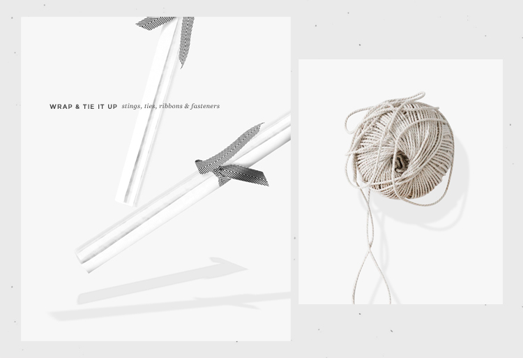
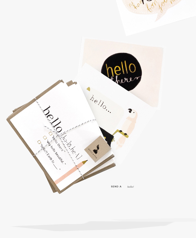
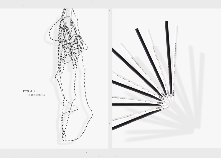
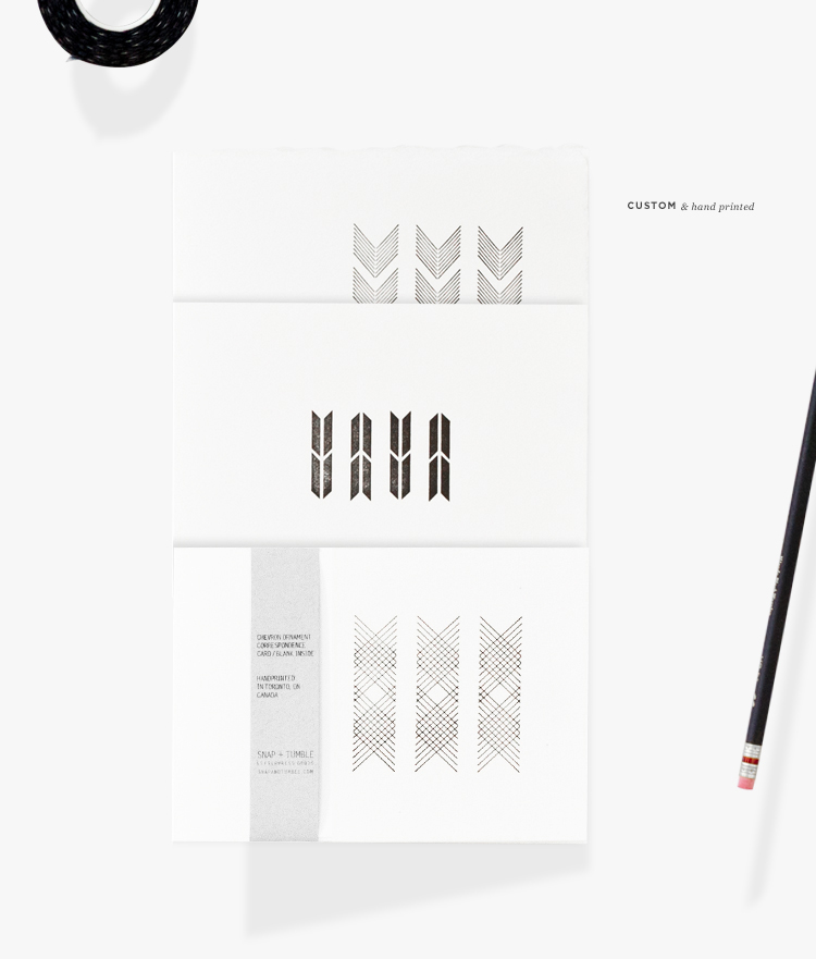
This past Monday I introduced a new brand to you called, Always Something. The shop/blog/ brand is run by Maria McBride and she has mission to provide her clients with a constant source of stationery inspiration. This means that Always Something values the idea of unique combinations of simplicity, sophistication and the hand crafted.

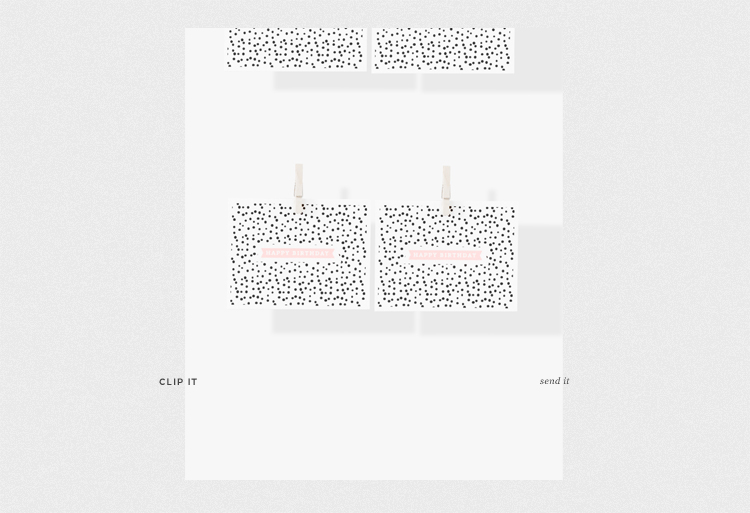
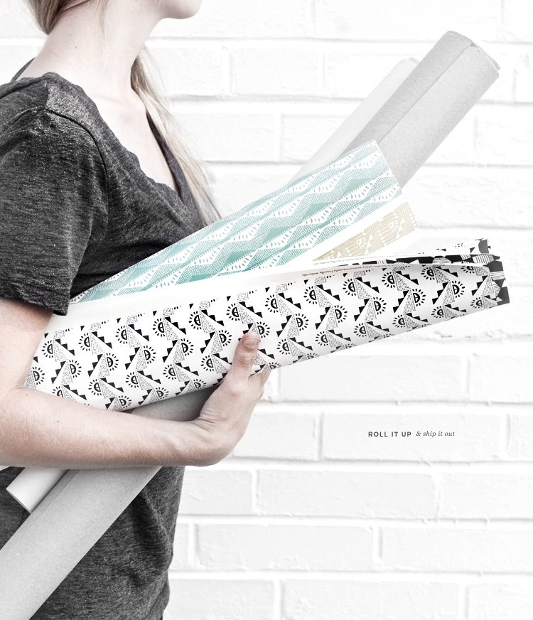
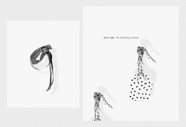
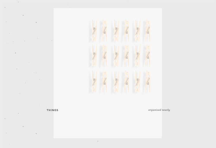
If you think about it, the name is really simple. There is “Always Something” to create, plan, share, celebrate, enjoy, inspire and give. With this Lookbook, I wanted to emphasis the simplicity of the objects being sold, ultimately highlighting their beauty. I also was hoping that by displaying the items in a unique way, customers would be inspired by them and they would be able to imagine all the possible ways they could use each item.

I had a lot of fun styling, photographing, photo editing and compiling the group of images to tell a story.

See my latest Lookbook for Cuyana. I’ll be sharing her blog design next week!

Recent Work: Cuyana Communications

As a contract designer for Cuyana I’ve had the opportunity to touch quite a few of their visual communication pieces, specifically visuals that live in the online space. Cuyana’s design strategy is very similar to my own. They say “Less is More” with everything. If it’s not an essential communication piece or design element, get rid of it! Same goes for the items in your closet 😉

The above images are a few of the pieces I create on a weekly basis for them. These pieces usually include emails, blog updates, online store maintenance, consumer engagement and the occasional event promotion. All of these elements are working together to get their brand message out there and inspire their customers. I’m pretty lucky to be a part of all that 🙂

You can sign up to receive their weekly emails and follow their blog.

Recent Work: Veda House Re-Branding (mood board)

OMG! I don’t really know where to start with this post. I feel like I’ve mentioned this whole VH rebranding project for months now, with nothing to show for it. Here’s what happened….

I started the whole rebranding process while I was still working at my 9-5 design job. I was eager to have a fully rebranded identity once I launched myself into the world of full-time freelance. That was the goal at least, but once I actually left my job to do freelance full-time I started to discover my design aesthetic morphing into something new. I felt the transition was taking me in a more sophisticated tone, so I stopped the rebranding process to see where this new found freedom would take me.

It’s now 4 months into this new adventure and I’m feeling pretty confident on where I’ve landed. I’ve defined a need to mesh together the handmade aspect  with the “seemingly perfect” aspect of my photography and graphic design aesthetic. When you are someone who values minimalism, it’s really tough to do any kind of “meshing” when you have minimal elements to work with.

You can see a little more where this project started –> April 2013, September 2012 (Part 2), September 2012 (Part 1)

Studio Hours: Photo Shoot Process


Sooo…I’m not really sure what’s going on in the studio today, but THIS happened, so I thought I’d share a little bit about my process.

Step 1: Research what project you’d like to do and see what other people have done. For this project, I collected images (like this one, and this one ) and put them on my Pinterest board. I was also heavily inspired by the work of Scout & Catalogue, especially this post.

Step 2: Get crafty. I wasn’t sure what color I wanted, so I played around with a lot of different dye combinations until I landed on a mixture of navy blue. This part was pretty labor intensive, but also a fun way to explore color combinations. I then used those same techniques and applied them to larger pieces of fabric. (see fabric swatches above)

Step 3: Sketch out what photos you want to take so you have a better idea of composition once you start shooting. I find this step to be super helpful to the overall process.

Step 4: Before each shot, I take a Polaroid capture of the scene to see if the objects in scene are working the way I want them to. If not…adjust before taking the actual photo. (see all polaroids above)

Step 5. Take a bunch of images at a bunch of different angles. A lot of time I’d choose an unexpected image to share later on.


Stay tuned to find out what all this fabric dying mess was for!

Recent Work: Cuyana Summer '13 Lookbook


I haven’t officially announced it yet, but I’ve been working with Cuyana on a weekly basis since this past April. I was hired on as a contract designer to work on all the brand visuals, create content for the blog, design weekly emails, help with launching each season, and help with the occasional event. The job has been really great and I’ve been able to work on a few projects that I’ve always wanted to including…the Summer Lookbook (launched on June 6).

Although I didn’t travel with the team to Turkey to capture the spirit of the season, (where this season was inspired by) I was able to take all the beautifully captured photographs and compile them into this season’s Lookbook. This season’s items were inspired by the beautiful landscape and handmade culture of Turkey and I’m excited to share the piece with you!

*I’ll be updating my portfolio soon with many new projects, including a handful of projects with Cuyana. You can view all 30 pages here —>

Studio Hours: Behind the Camera


The beauty of non-existant budget photo shoots! You’re the model, the photographer, the prop, the everything. You quickly learn to multi-task, hold things down with your toes, set up your camera timer….and then RUN! Yup…the beauty of working for yourself 🙂

These photos are a little sneak peek into one of the current projects. I’m working on pulling a few brand asset images together for her to use to promote the launch of her new blog and website. I’ll also be sharing the full lookbook on the blog within the next week or so. I’ve had  A LOT of fun playing with unique compositions, play on light and adding in a little of the unexpected.

Studio Hours: Tie the Knot / Photo Holders


Next May, I’ll be getting married to my favorite person of all time. We’ll be getting married on a beach with our closest friends and family. Over the next year, I’ll be sharing some of the personal touches we’ll be making along the way. We want our wedding to feel carefully crafted and full of our personality.

First up are these doorknob photo stands. I’ve been a big collector of small vintage trinkets and these porcelain knobs (found at a flea market) are one of my favorite items. The project was super simple and only required a few things: pliers, aluminum gage wire and a screwdriver. I love how we’ll be able to share our photos and the story behind how we made the stands.

Want to see our wedding mood board?

In The Studio: Spaces Feature

I’ve been lucky to be featured in the Eva Black Spaces feature for a second time. I’m over on Eva’s blog today talking about my home studio space and how it’s transformed since moving into the new house. You can see my old studio tour here, and the follow up tour here. In the old interview, I talk about where I found some of the vintage pieces and how I started my creative journey.

The SPACES feature on Eva’s blog is one of my favorites in blog land and I love how it shows how diverse the creative community is. The feature interviews several creatives and gives you a glimpse at how they work at home. I hope you enjoy the feature as much as I do. 🙂

Recent Work: Verily Magazine


I’ve got a little project to share with you! My friend Jane (now Art Director for Verily Magazine) was looking for someone to help her with some divider pages for the Summer issue of Verily Magazine. She wanted something bold and hand-crafted that she could use to help divide up the sections of the magazine in a cohesive way.

I decided to take on the challenge and do something not only out of my comfort zone, but also something I’ve always wanted to toy around with – watercolors. After playing around with watercolor like a kid in grade school, I landed on 4 section images that all use watercolor in an abstract floral way. Let’s just say that I had a blast working with Jane, Verily and watercolors and I look forward to possibly collaborating with Verily Magazine in future issues.

* My other friend, Mary Frances Foster has a few of her fabulous illustrations in the issue as well! You can also find a beautiful story by the girls of The WeaverHouse.

Little Snippets No.6

Freelance work and wedding planning are keeping my crafty fingers busy. Stay tuned to see a sneak peak at the above photoshoot!

Follow me on Instagram for daily snippets

Loading...